Bodega
This page will give you information about Bodega, our Paid Landing Page (PLP) CMS. For any additional questions you may have, please see the Bodega FAQ.
Bodega Access
Bodega Production
To access Bodega, you must be signed into OneLogin. Once logged in, you can access through the OneLogin Portal or you can go directly to the URL https://bodega.2u.com/.
Bodega Staging
The Bodega staging environment is primarily used by the Devs when they are creating and testing new features. We only use Bodega Staging for On-Boarding and learning how to use the CMS. There is no way to copy pages from Staging to Production. When building pages that are to eventually be published, make sure to use production.
Bodega and Whitelabel
The Bodega CMS does not allow for any custom code. All branded design elements (logos, colors, headers and fonts) are connected to Whitelabel. If the color does not exist in the Program Whitelabel Theme, you will NOT be able to use that color on the PLP.
Bodega Admin
Once you have logged into Bodega, you will see a list of all Programs and how many live, modified and draft pages there are for each program. Live means the page is published and what you see on the canvas is the same that is on the live page. Modified means that the page is live but there are changes on the page within the canvas that are not published on the live page. Draft means you have built out a page within Bodega but the page is has not been published.
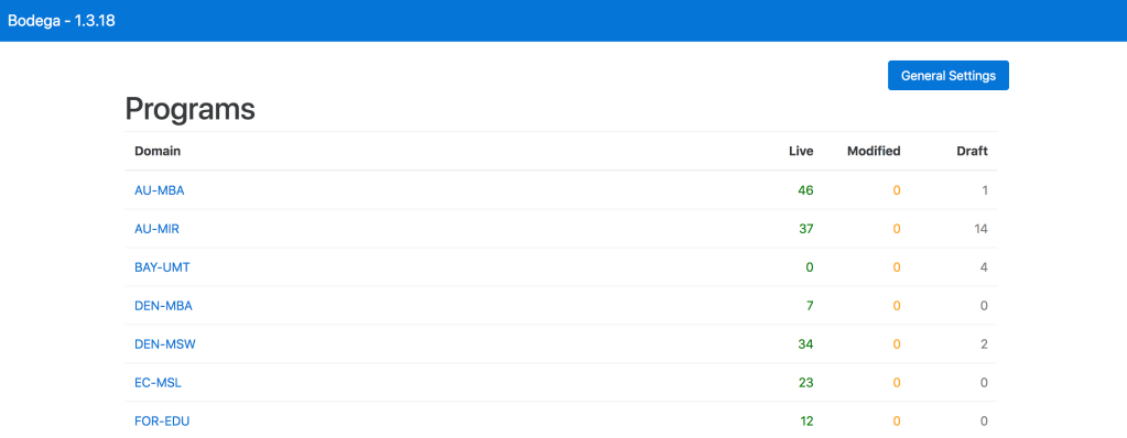
The General Settings button is only used by the Devs. They use this section to update the Lead Form version. Web Producers should not do anything with in this section.
Program Page List
When you click through to a program from the Admin page, you will see a list of all the pages for that program. On this page you will see the following information:
- slug: URL of the page
- description: used by CRO to help identify each page
- status: live, modified or draft
- device: desktop or mobile page
- edit: click to enter the canvas and edit the page
- preview: preview the page as it would appear in a browser
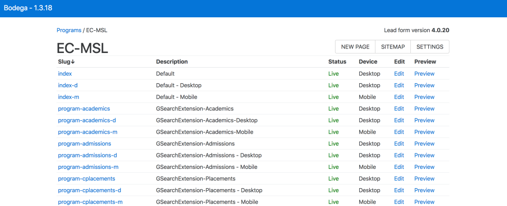
All of these headers are sortable. If you click on them, they will organize by that column. For example, if you click on Device, all Desktop pages will be at the top together with Mobile pages below.
In the top right corner you will also see three buttons: New Page, Sitemap and Settings. Selecting New Page will bring you into a blank canvas to build a new page. Selecting Sitemap will open a new window with the Sitemap, which includes information about each page. Selecting Settings will bring you to an area to fill out fields about that specific program.
Settings
The settings for each program contains information specific to that program. Many of the fields you complete here will populate in the automatic footer.
The fields to include here are:
- University Name
- Program Name
- Phoneword (optional)
- Phone number (optional)
- Copyright Text (do not include date)
- Optimizely ID: get this from the CRO team
- Segment Key: get this from the CRO team
- Privacy Policy url: link to cask marketing site
- Terms of Use url: link to cask marketing site
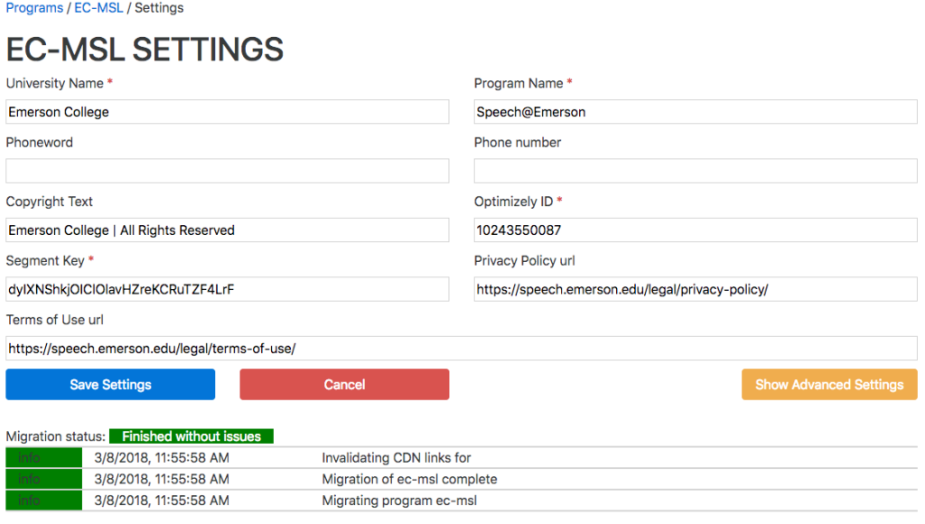
Once you have filled out the fields, press Save Settings
Web Producers do not have to worry about the Advanced Settings button here. This is only for the devs.
Creating a New Page
To create a new page, select the New Page button in the upper right corner of the Program admin page. This will take you to a blank canvas. The only thing that automatically loads here is the header and footer. The header logo and the colors get pulled through whitelabel and the content in the footer gets pulled through what was entered in the Program settings.
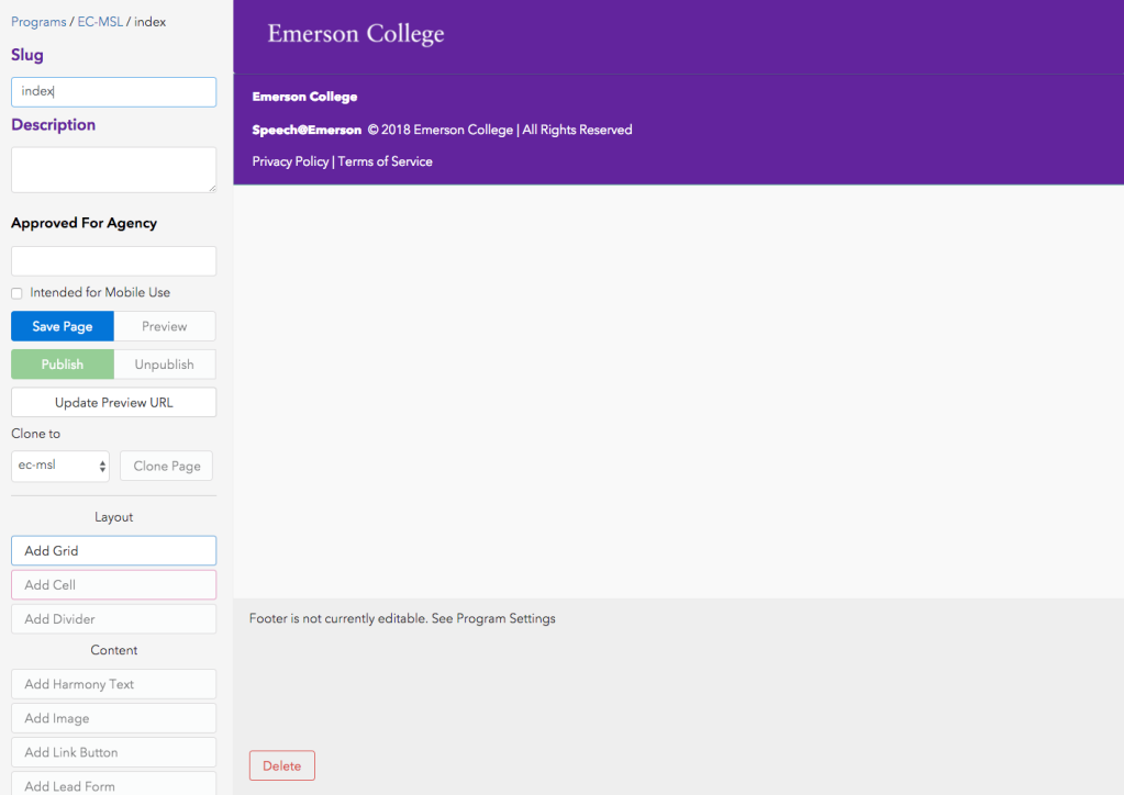
Before adding any content to the page, it is best to fill out the first 3 fields and then save the page.
- Slug
- Description
- Approved for Agency
These fields should be provided by the CRO team and in your Bodega JIRA ticket.
Layout Options
The Layout widgets provide structure for your page. The 2 main widgets are:
- Grid
- Cell
Grid
When adding a grid, there are a few settings you have to chose from.
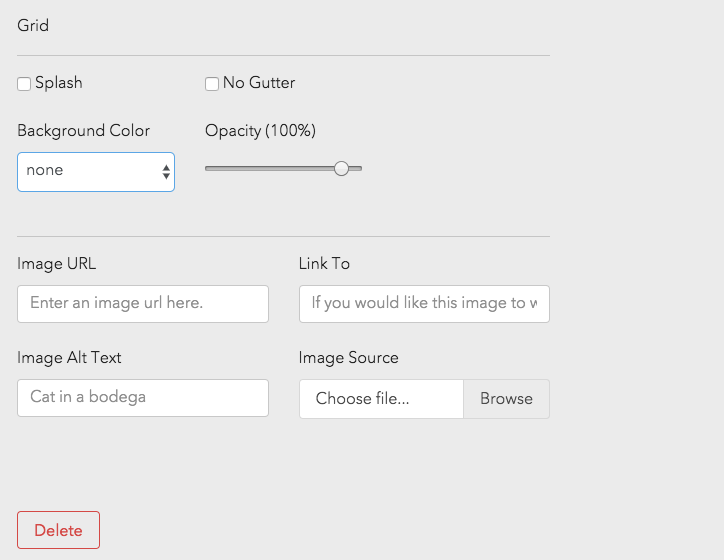
- Splash: Checking this off will bring all contents in the grid edge to edge, meaning there is no padding on the edge of the page. The most common use for this is when adding in your hero image. Most often, hero images are set to splash
- No Gutter: Grids in bodega have an automatic padding so that content does not go edge to edge. If for some reason you want this, you would check off No Gutter. A common use case for this is for the Lead Form on mobile. If you set the grid in which the Lead Form sits to No Gutter, the Lead Form will take up the entire screen, edge to edge.
- Background Color: Here you can set a background color for the grid. Your color options are pulled from Whitelabel.
- Opacity (100%): You can change the opacity of that background color for the grid using this feature.
- Image URL: This field gets populated when you upload an image using the Image Source field. If the image is hosted elsewhere, you can also paste in an image path here.
- Link To: If the image needs to link somewhere, you can add the link in this field.
- Image Alt Text: If the image required Alt Text, add it here. Refer to Accessibility Guidelines to learn more about Alt Text.
- Image Source: Use this field to upload your background image for the grid.
- Delete: To delete the grid widget from the page.
Cell
Use the cell layout option to organize your content. Cells sit within Grids. You can have multiple cells within a grid that span different widths all adding up to 12. When adding a cell, there are a few settings you have to chose from.
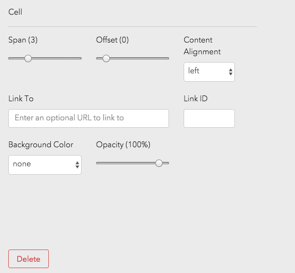
- Span: This will determine the column width of your content. Span of 3 will span 3 out of 12 columns.
- Offset: This will push your cell to the right. Offset of 2 will push your cell of span 3 2 columns to the right, equaling 5 columns.
- Content Alignment: This will align all content within the cell.
- Link To: If your cell needs to link out, add URL here.
- Link ID: This ID is used for tracking.
- Background Color: Here you can set a background color for the cell. Your color options are pulled from Whitelabel.
- Opacity (100%): You can change the opacity of that background color for the cell using this feature.
- Delete: To delete the cell widget from the page.
Divider
The divider widget is used to had a horizontal rule to the page. When adding a divider to the page, there are a few settings you have to chose from.
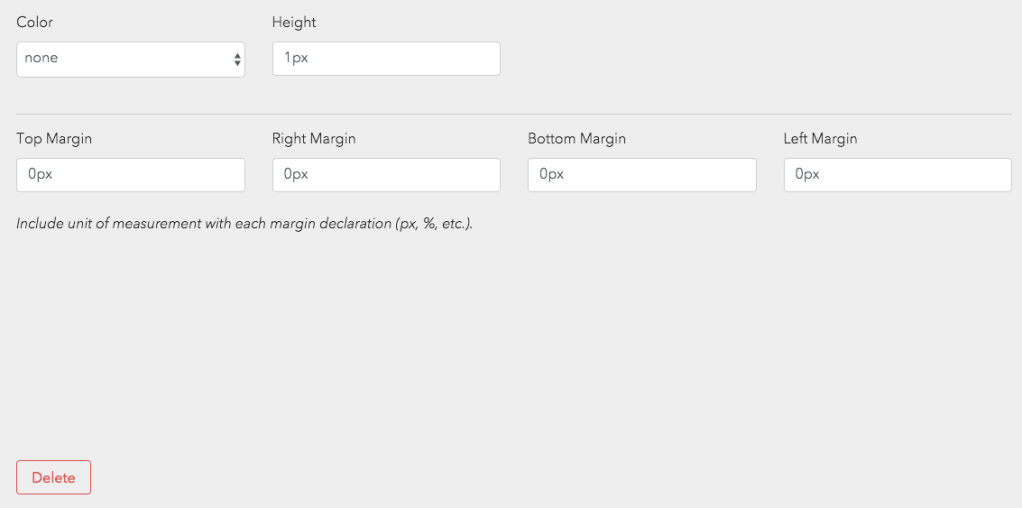
- Color: Select the color of the horizontal rule. Your color options are pulled from Whitelabel.
- Height: How tall should the divider be?
- Margins: Add space around your divider. Add it to the Top, Right, Bottom and Left side.
- Delete: To delete the divider widget from the page.
TIP: When adding a divider to your page, immediately make your divider ~10px tall. This will make it easier to grab and drag if necessary. You can edit the height after, once it is definitely in the right place.
Content
Inside of cells you add content widgets to enter your content. The content widgets are different depending on what type of content you want to enter. Below are the different widget types and the particular settings related to each widget.
Harmony Text
When adding text to a page, you will always use the Harmony Text Widget. This widget has many styling options that are pulled from Whitelabel.
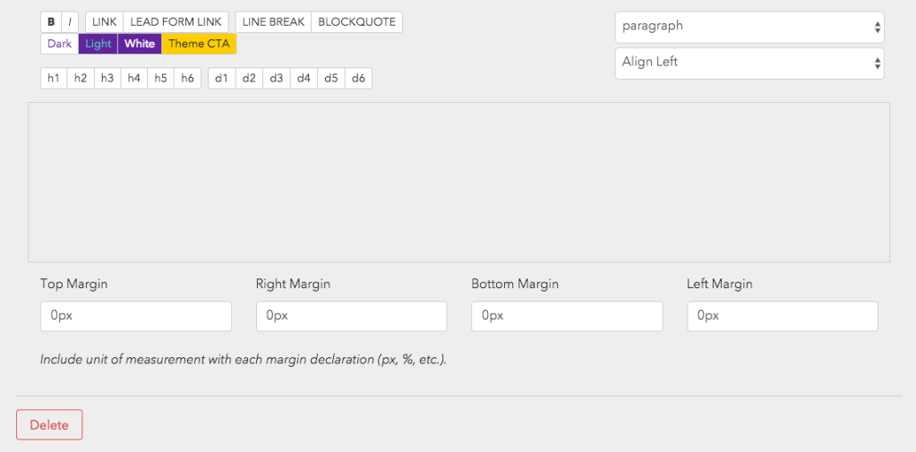
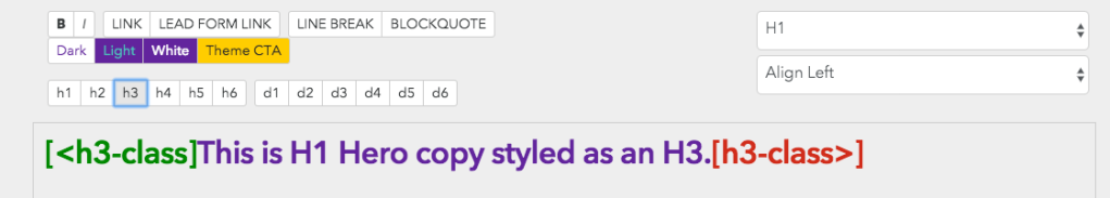
- Paragraph Dropdown: This is used for accessibility. For example, if you are adding hero copy to a page that is mean to be an H1, you should select H1 from the drop down. For accessibility reasons, all header page structure should be set using this dropdown.
- Alignment Dropdown: Use this to align your text.
- B & I Buttons: These will Bold and/or Italicize your copy.
- Link & Lead Form Link Button: These allow you to add links to your copy. The Lead Form Link button makes it easly to link copy back to the Lead Form on the page.
- Dark, Light, White, Theme CTA Buttons: Using these buttons will override the color of the copy that is set with the accessibility dropdown.
- Header Buttons (h1-h6) / Display Buttons (d1-d6): These buttons are used to override the style that is selected for accessibility. For example, if the H1 style is too large for the hero text, you can override the style using the header or display buttons. See example below.
Bodega HTML Markups
| Element | Code | Example |
|---|---|---|
Superscript 1 | ¹ ; do not add space before ; | |
Superscript 2 | ² ; do not add space before ; | |
Superscript 3 | ³ ; do not add space before ; | |
Superscript 4 | & #8308 ; do not add any spaces | |
Superscript 5 | & #8309 ; do not add any spaces | |
Up arrow | &uarr ; do not add space before ; | N/A |
Link that opens new window | [<link:https://2u.com/ target:blank]partner and its affiliates[link>] | N/A |
ID for anchor links | [<link:https://2u.com/ target:blank id:this-is-id]partner and its affiliates[link>] | N/A |
Title attribute for screen readers | [<link:https://2u.com/ target:blank title:this-is-title]partner and its affiliates[link>] | N/A |
Footnote reference example (top) | [<link:#fn1 id:fn1b]¹[link>] | |
Footnote example (bottom) | [<link:#fn1b id:fn1]↑[link>] | N/A |