Responsive Image Wrapper
The Responsive Image Wrapper block should be used in place of the 2U Image block, when you are wanting to control different breakpoints.
Once you have inserted the block, you should see 3 tabs reading Desktop, Tablet and Mobile:
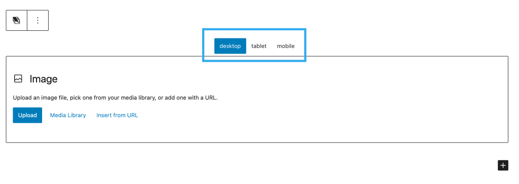
You can choose a different image for each breakpoint.
Note: If you place an image for Desktop but not the other breakpoints, the Desktop image will be used across all breakpoints.
Each image selected for the different breakpoints will have it’s own group of settings which include (these can all be set for each breakpoint, using the responsive device controls):
- Padding & Margin
- Alignment
- Border Radius
- Border Color
- Border Width (px)
- Image Size