Hero Block
Hero Title Goes Here
Hero Text Goes Here
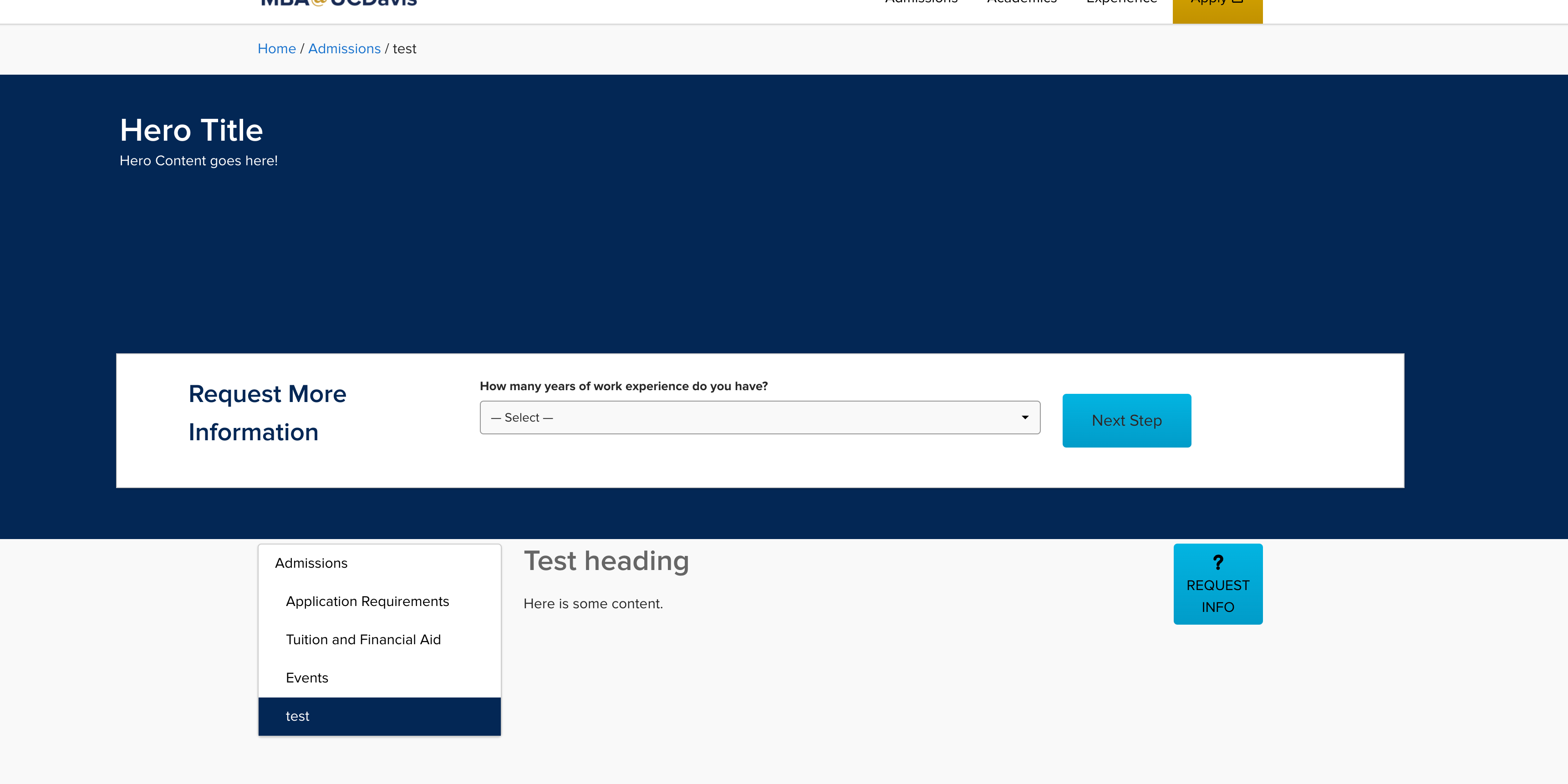
The Hero Block is used as the main cover at the top of a page. The hero block houses numerous settings and allows for the insertion of Hero Lead forms using the Taxi integration.
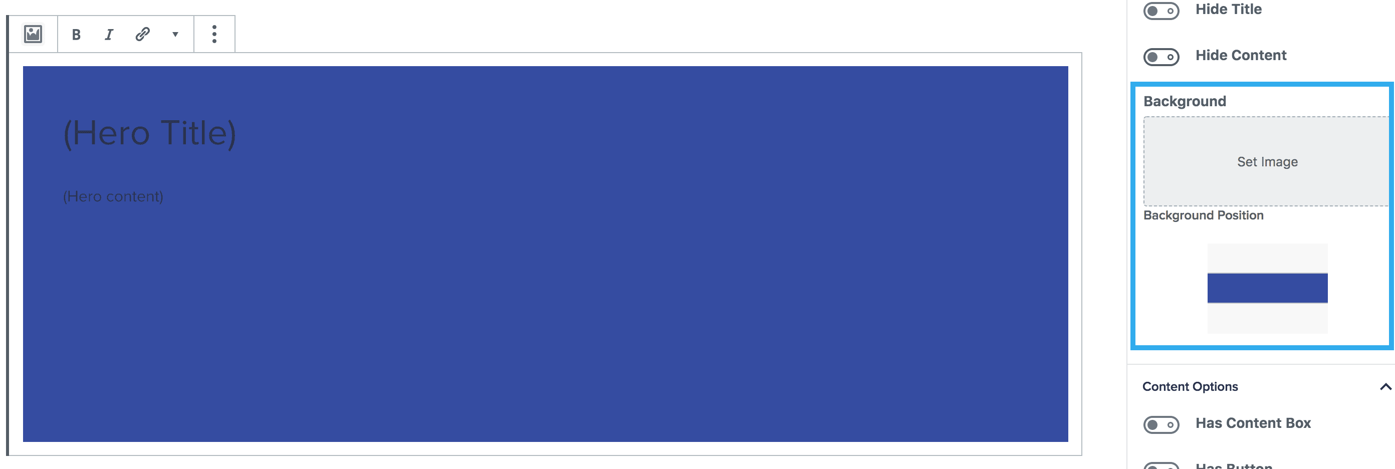
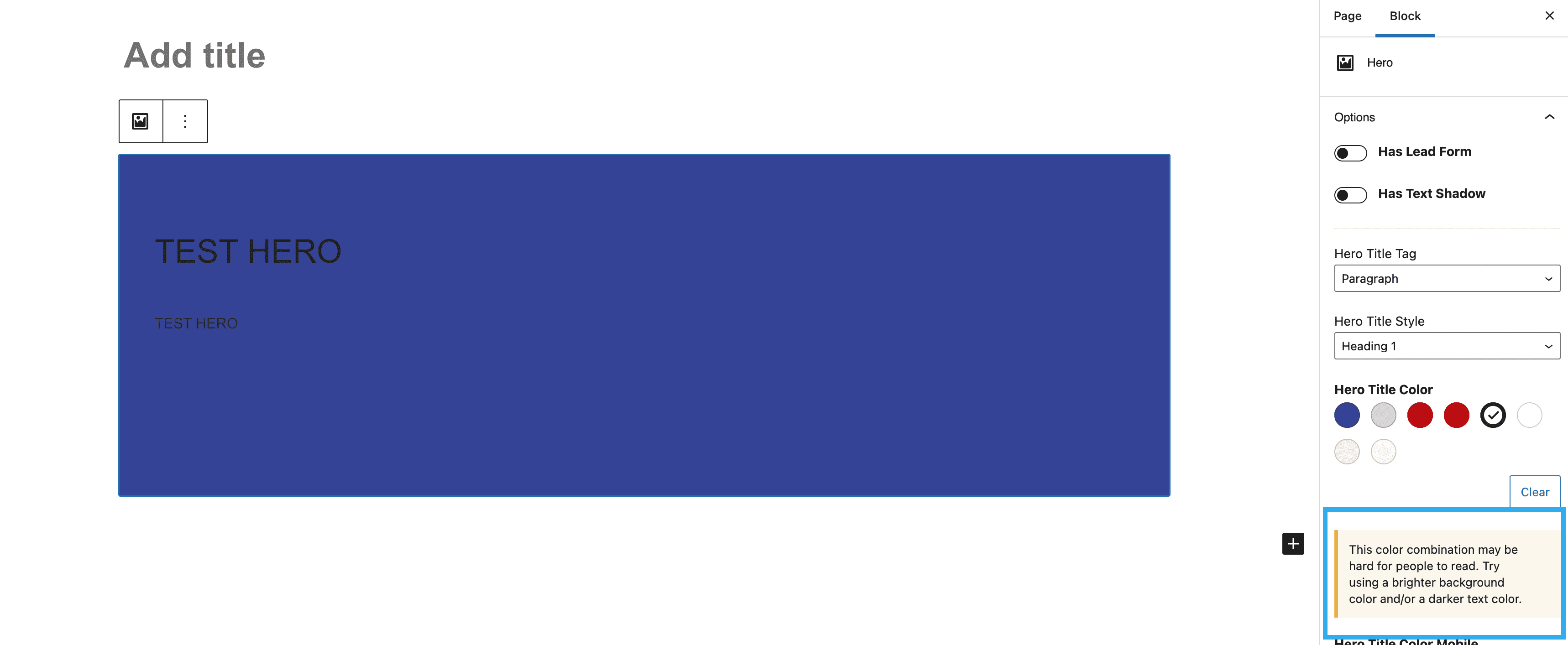
Background Image Setting
When you initially insert the hero block, the background colour of the hero will be set to the theme-dark class as default, which is pulled over from Whitelabel. You can then choose your background image, using the settings on the right-hand panel, including the position of your background image.
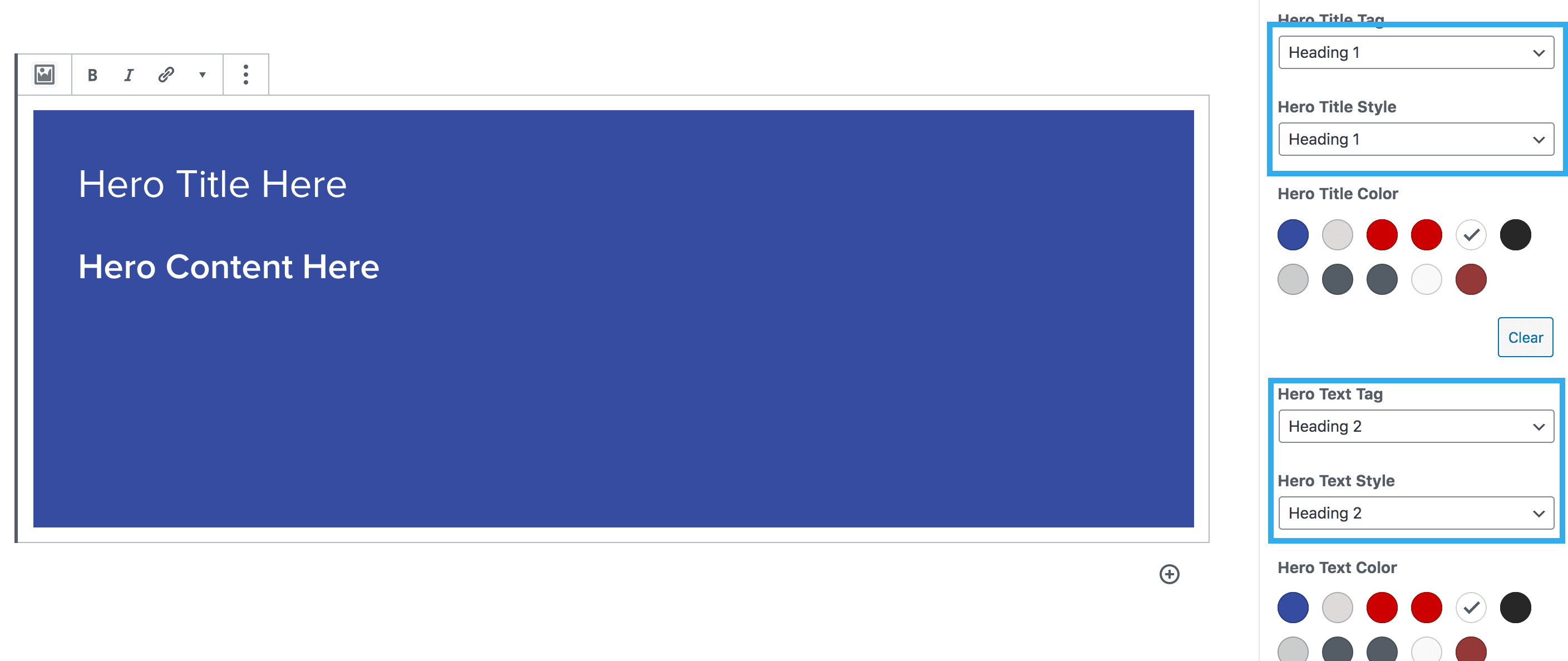
Hero Title & Text Settings
Once you have inserted your hero title and hero content, you then have numerous options to change the title/content tag e.g. h1, h2, h3 and so on, and the title/content text style; which means you have have a h1 in the which outputs the style of a h2. You can also select the title/content text colour, alignment and vertical position.
The tag drop down refers to the text tag that semantically should be used. The style dropdown refers to a style override.
Example: if you wanted a H2 with a styling of a H3 for your hero title, you would choose a hero title tag of H2 and a hero title style of H3. This would give you an equivalent of <h2 class=”h3″>…</h2>
You can also select different colours specific to desktop and mobile. Meaning when the hero is viewed on mobile it can appear differently to how it is viewed on desktop.

The Hero block also includes a feature which triggers an alert should the background and text colour combination not meet the minimum colour contrast.
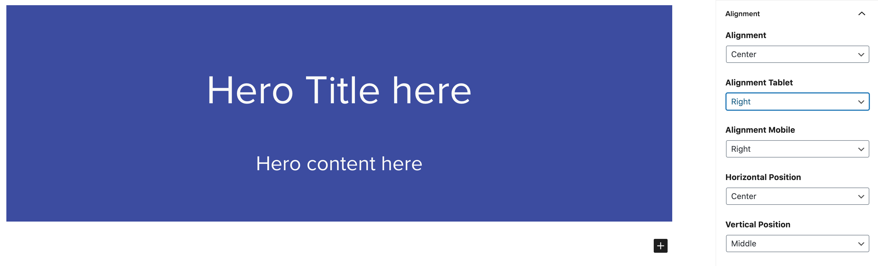
Alignment
Within the block settings panel you can change the alignment of the hero title and contents, and this can be edited specific to device.
Hero Content Settings
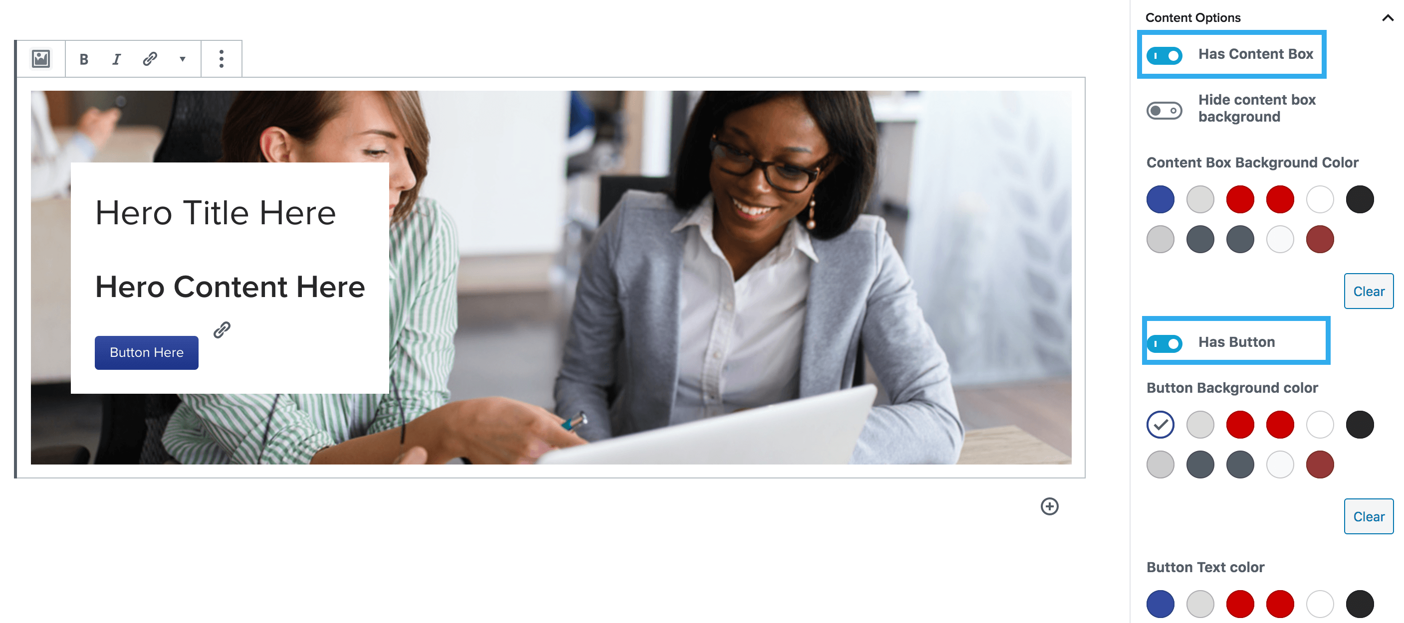
Within the settings, you can choose to have different content options. This would be used for heroes that generally do not have a Lead Form. You can choose to have a content box, usually placed on top of a hero image and also include the addition of a button and/or a border within the content box.
Button
Adds a button to the hero block. Ability to change background color and text color.
Border
Places a thick border on the hero block. Commonly used to insert a bottom border.
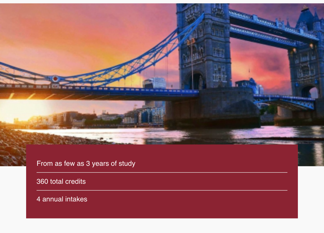
Content Box
Places a box with a background color of choice on top of hero image to put hero title and content. There is an option to not have a background color at all, which is helpful for restraining text to a certain area.
Toggling on the button setting with the content box setting on will result in the button being placed within the content box.
Note: You can also adjust the positioning of the content box, using the ‘vertical’ & ‘horizontal’ position settings under the ‘alignment’ dropdown. Plus set a min-height for desktop hero image
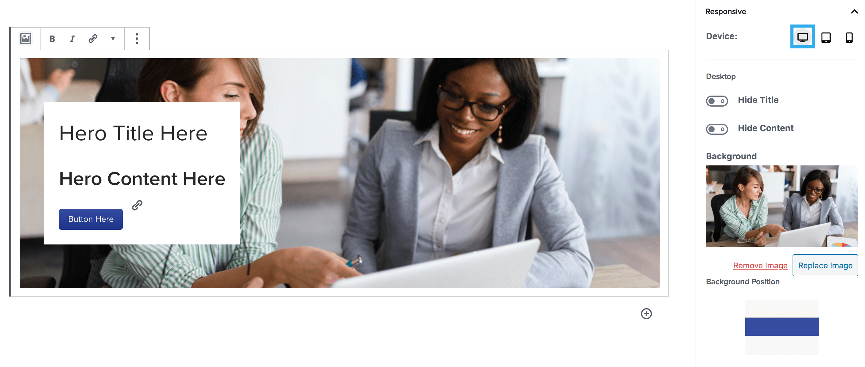
Responsive Device Preview Component
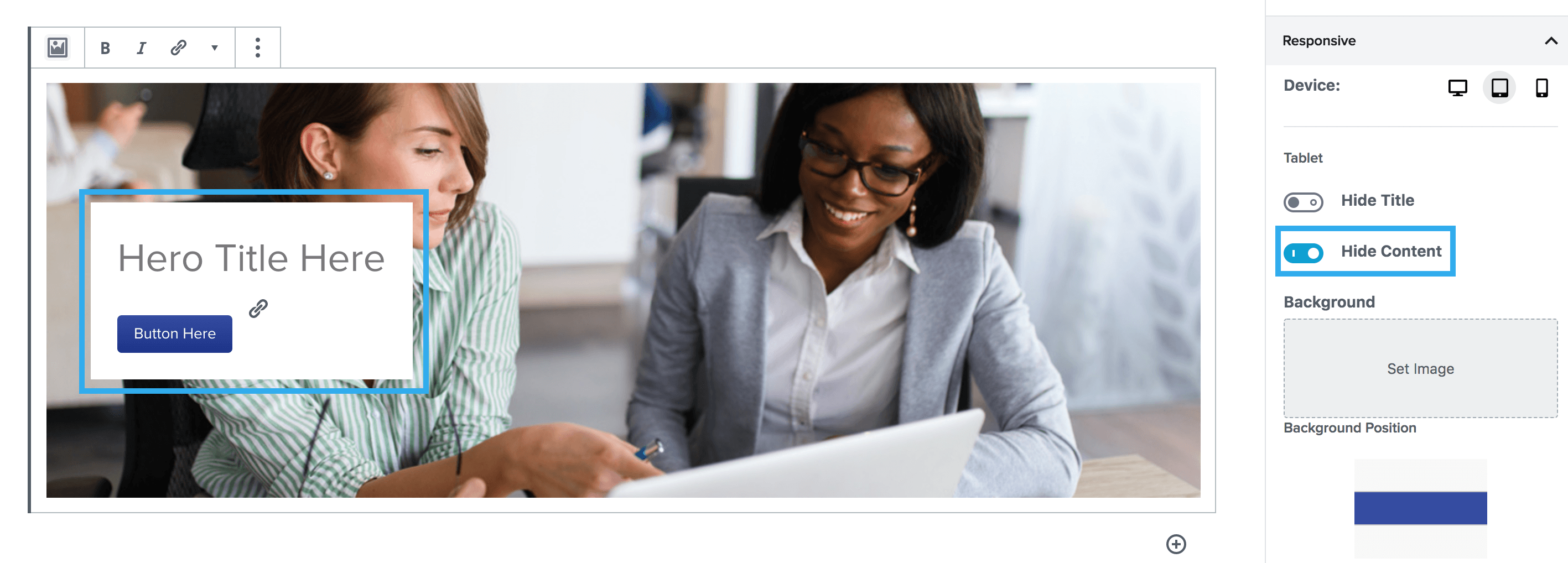
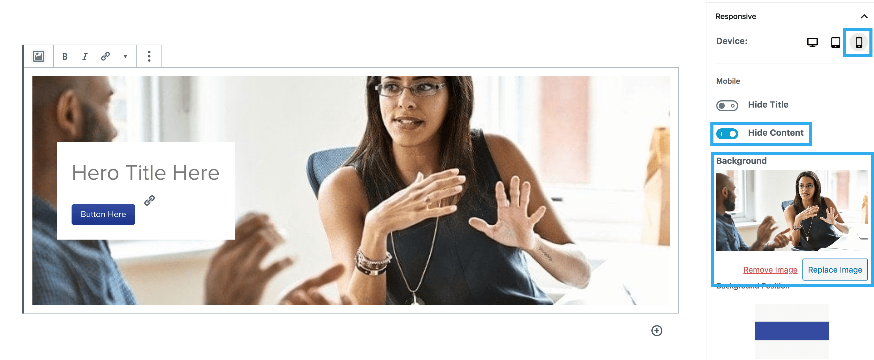
Within the hero block, there is a responsive device setting, which allows you to customise how your hero looks on desktop, tablet & mobile views. You can use this by clicking the icons for each device view and choose whether to hide/show the title & content, you can also select a different background image to show on this device view too.
The main reason this would be used, is if you want to hide specific bits of content, on different devices. You should use the device toggle to chose what device you wish to change, then chose the elements you wish to hide on that device.
Example:
Desktop: Keeping all elements visible
Tablet: Hiding the content
Mobile: Hiding the content & changing the background image
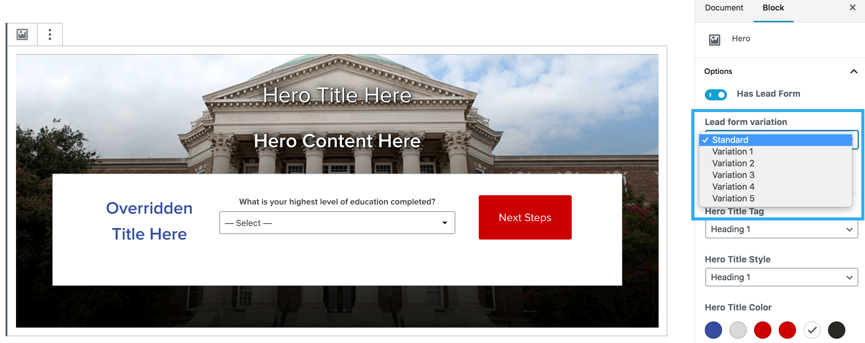
Hero Lead Forms
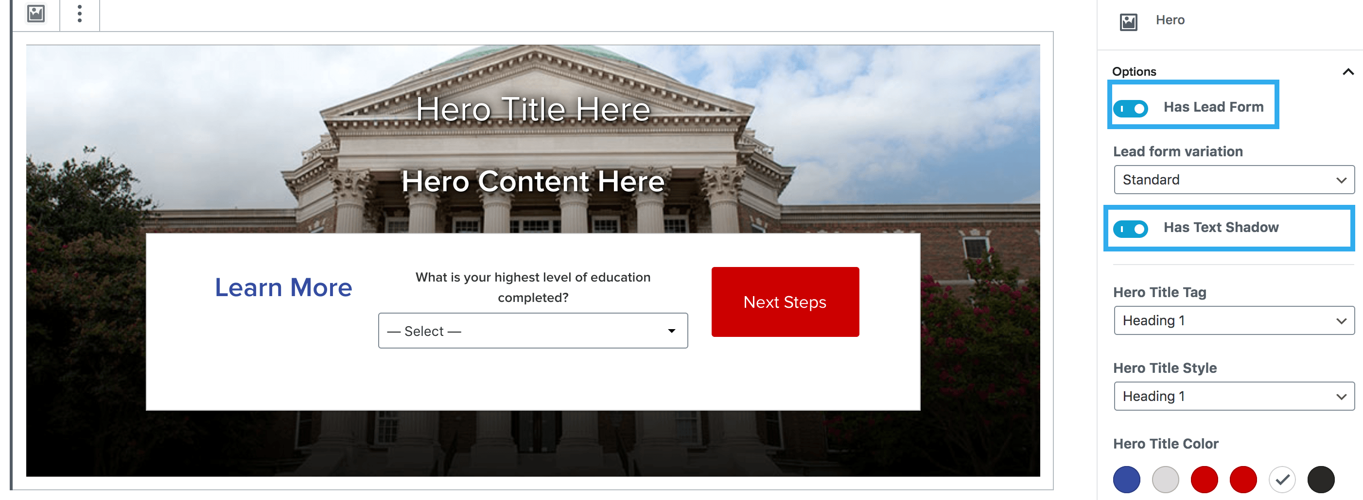
The hero block, supports the insertion of a Hero Lead Form from Taxi. Using the setting on the right-hand side of the screen, you can select Has Lead Form, this will then show a dropdown option to choose your Lead Form Variation.
To insert a Hero lead form you would need to:
- Click the toggle for Has Lead Form & choose whether you would like to apply text shadow to your hero title & text
2. Select which Template you want to use (generally, the homepage template should be used for a Hero, but you can insert an Inline or Event Registration lead form if desired)
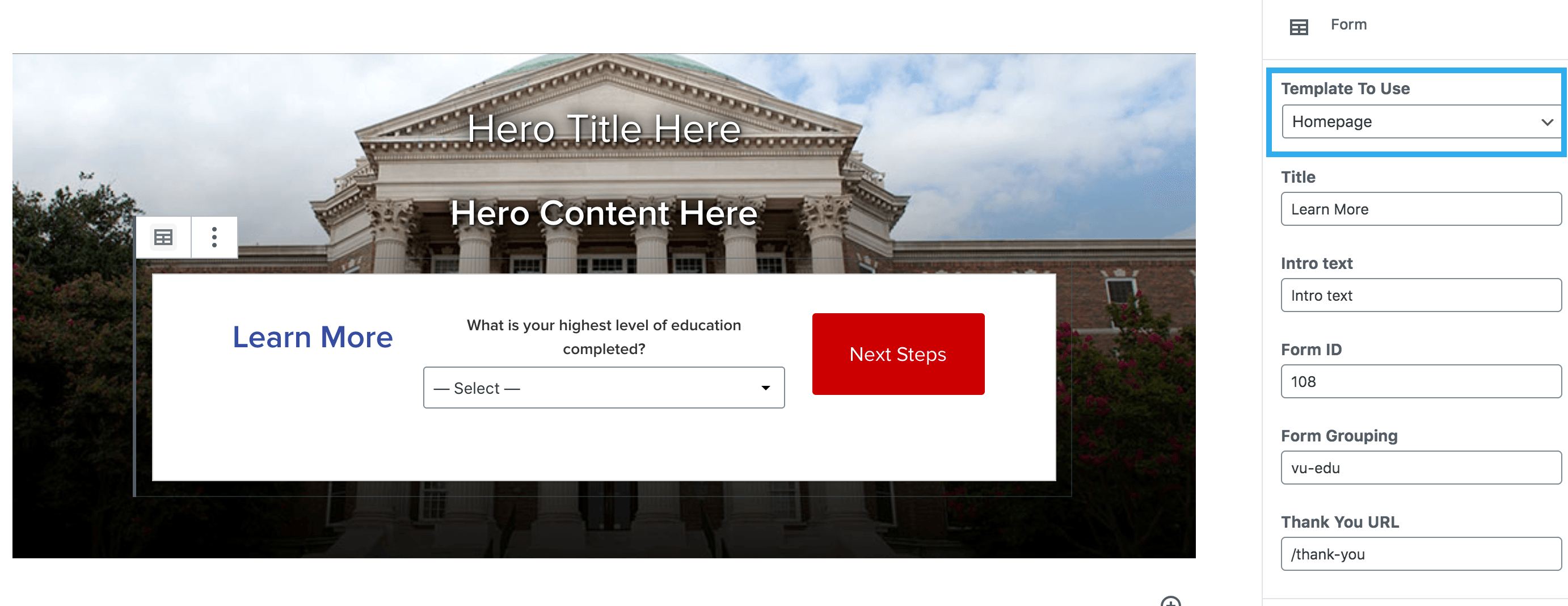
3. The Lead Forms will pull through the fields that are entered within the Global Settings area, you can override these using the fields on the right-hand side of the screen

4. You can then select the Lead Form Variation that you want to use. There are a total of 6 variations, that use the same rules as Harmony:
- Standard
- Variation 1
- Variation 2
- Variation 3
- Variation 4
- Variation 5
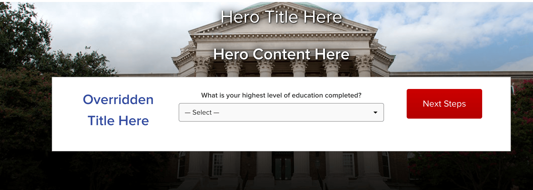
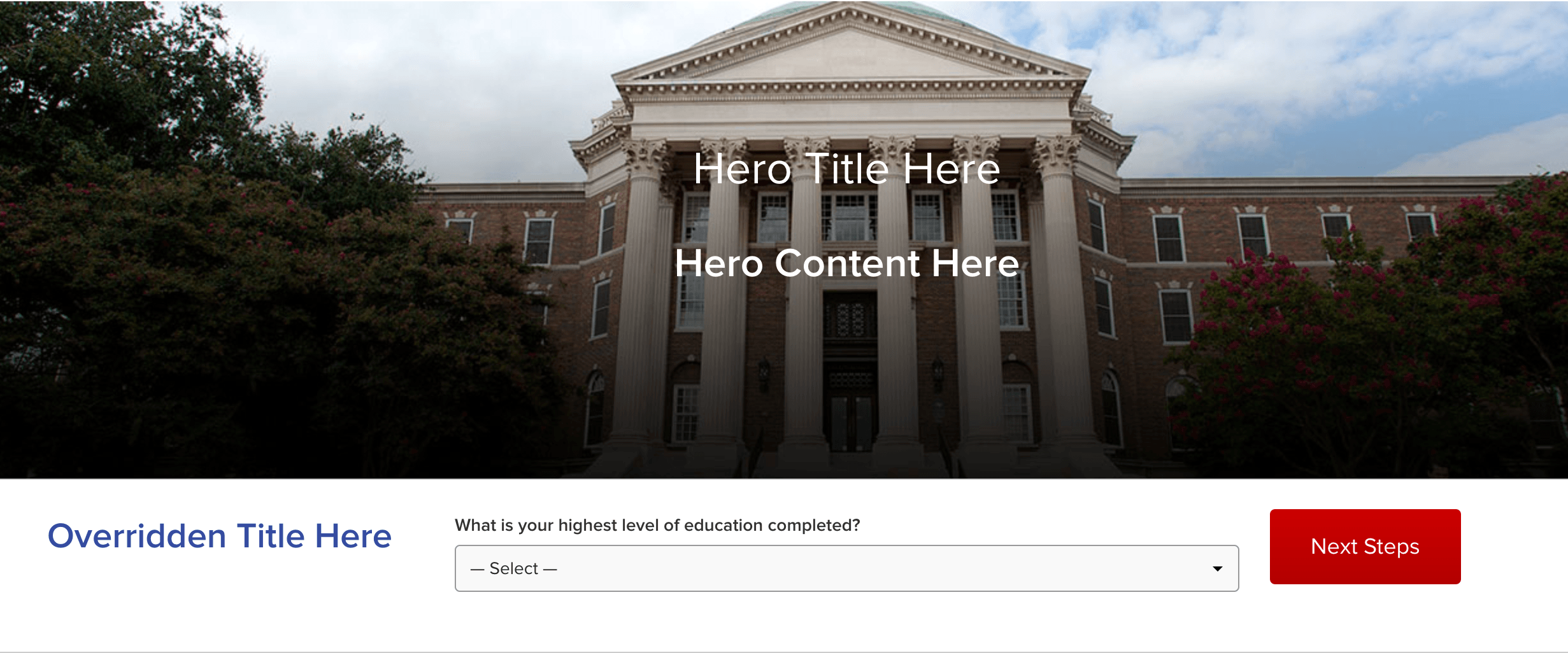
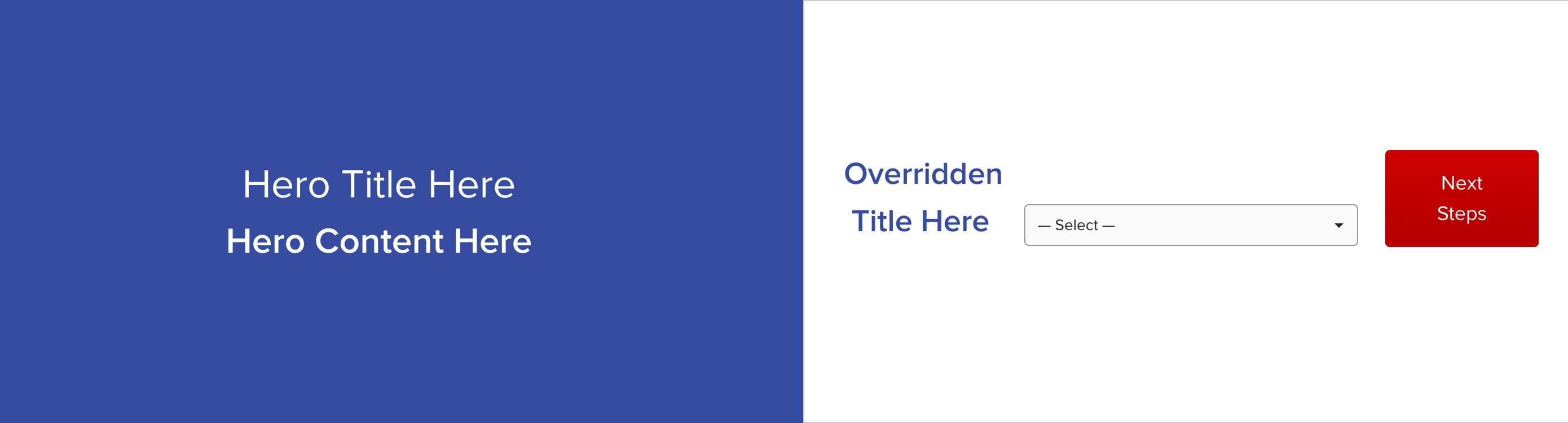
Standard
Variation 1
Variation 2
Variation 3
Variation 4

Variation 5
Hero on mobile
When using a Variation 4 lead form on the hero block, there is the option to hide the background image on mobile.

There is also the ability to set a mobile image for the hero, and have the lead form stack below that image on mobile.
Spacing
The spacing settings allow you to alter the margin around the hero title and the hero content. Each side of margins and can edited independently from one another and can be previewed in the settings panel:

Hero Negative Margins Feature
Below outlines the new features that come with the Hero block for creating an overlapping content box in the block.
How to use
Begin by toggling on the ‘Has Content Box’ feature, once you’ve done this you will see a number of new features available. These are the following ‘Add More Content’ ‘Override Padding’ ‘Content Box Overlap on Mobile’ and ‘Content Box Background Opacity Desktop’
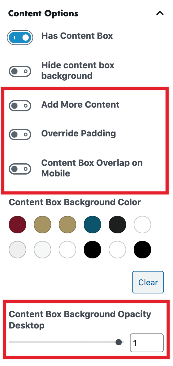
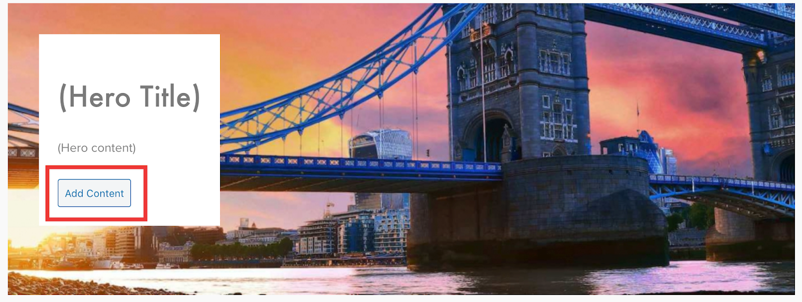
Toggling on the ‘Add More Content’ will produce a button on the content box in the block to add content. When you click add more content it will automatically include a separator between the text within the content box (see front end example at bottom of page).
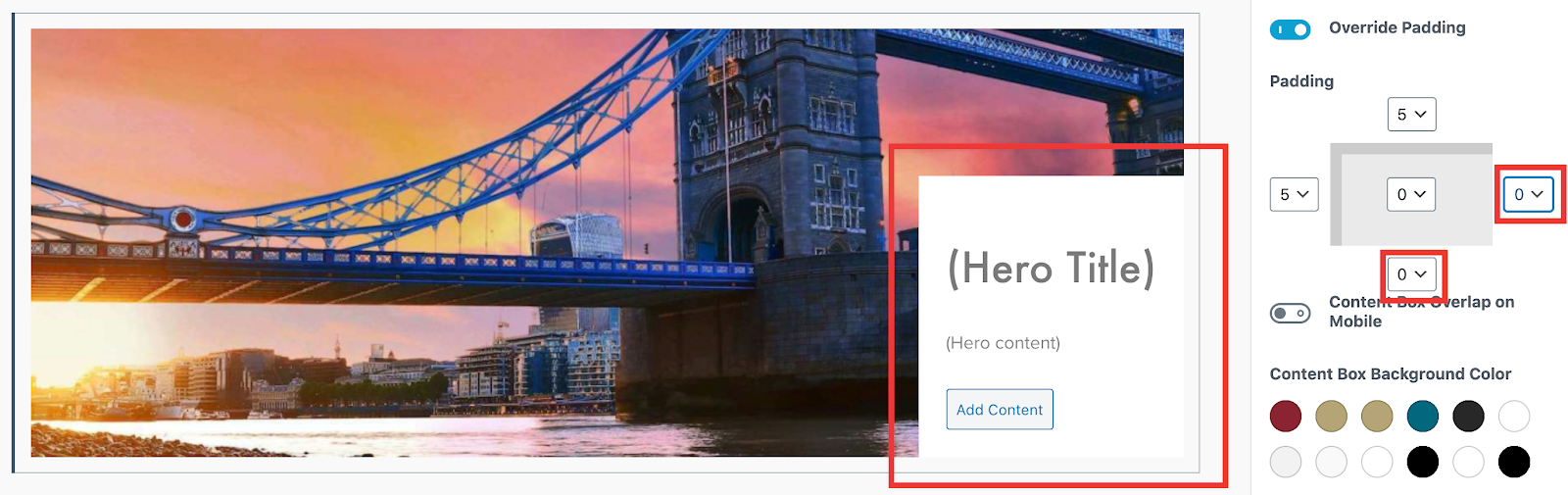
Overriding padding
Toggling on the ‘Override Padding’ will allow you to set your own padding based on where the content box is positioned in the block. In the example below I have moved the content box by setting the ‘Horizontal Position’ option to ‘right’ and the ‘Vertical Position’ option to ‘bottom’ I then adjusted the bottom and right hand side padding so that the content box sits flush with the edges of the block.
Overlapping on mobile
Toggling on the ‘Content Box Overlap on Mobile’ provides the option to put in a number value of how many pixels you want the content box to overlap the hero block when viewed on a mobile.
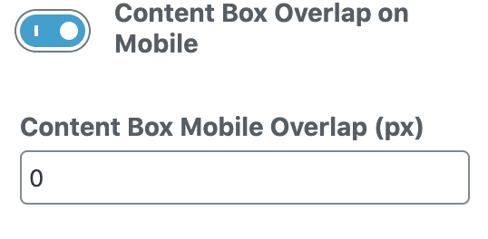
There are a number of things to consider when setting this value. 1, the result of putting in a value here does not affect anything on the backend. The result can only be viewed on the frontend. 2, the value set has to take into account the amount of content you put in the content box, so it could be a bit of trial and error before getting the desired result of the overlap.
Background Opacity on Desktop
The last new feature on the backend is the ‘Content Box Background Opacity Desktop’. This allows for an opacity to be set when the user chooses a color from the ‘Content Box Background Color’ options.
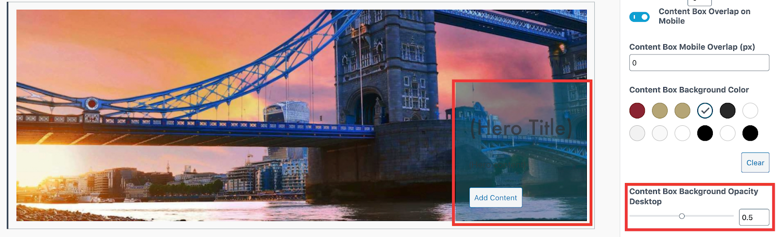
This option is only applied to the content box when viewed on desktop. When viewed on tablet or mobile the colour goes back to a solid colour.
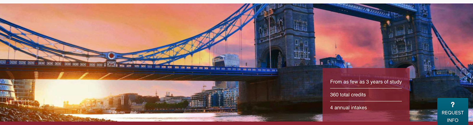
Combining the features
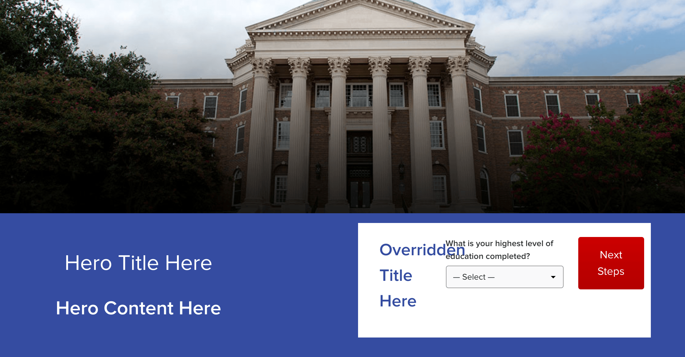
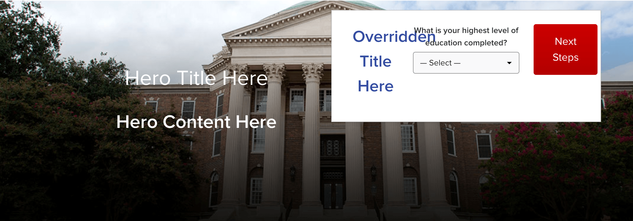
With these new options and a combination of the options already available in the block you will be able to create the following example, as viewed on the frontend.
Desktop:
Tablet & Mobile:
Hero above Sidebar
You can now place the Hero block above the Sidebar block within the editor. To do this, you need to first insert a Hero block above the Sidebar block in the page editor. Go to Page settings in the right-hand sidebar and under the Template dropdown, select Hero Full Width:
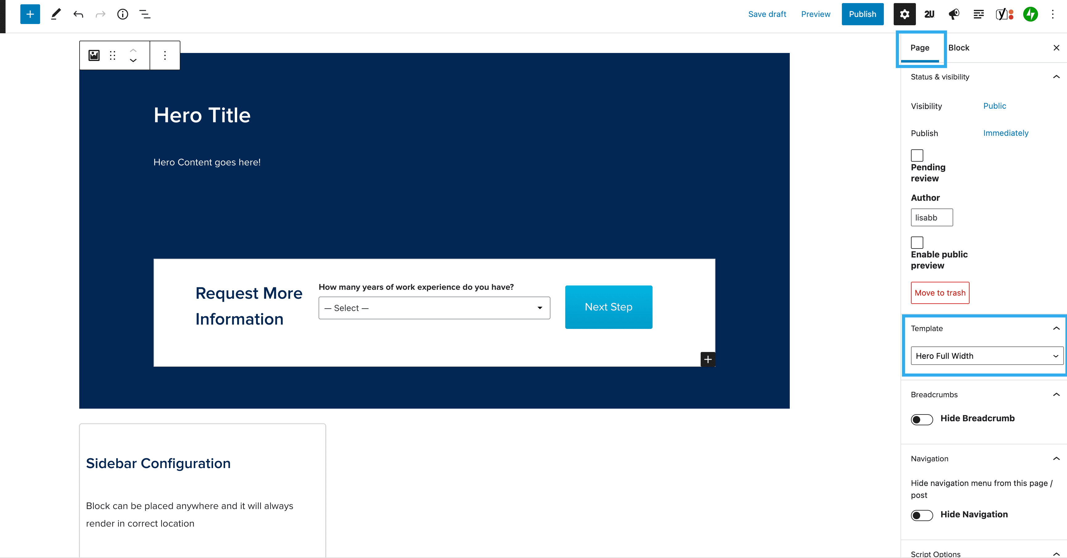
When you publish the page and view on the front-end, you will see the Hero appear above the Sidebar, as seen below: