
Card 1
Some card content can go here.
The Custom Card Block can be inserted on it’s own, or within a column builder block, depending how many cards you want in a row.
Note: If you insert the custom card block within a column builder block, these will stack responsively as default.
Some card content can go here.
Some card content can go here.
Some card content can go here.
The card title settings act independently to the other settings within the card. E.g. you can set individual padding for your title, which will remain separate from the rest of the content padding inside your card.
This works well when you have a background colour set for your title, which is a different colour to the rest of the card.
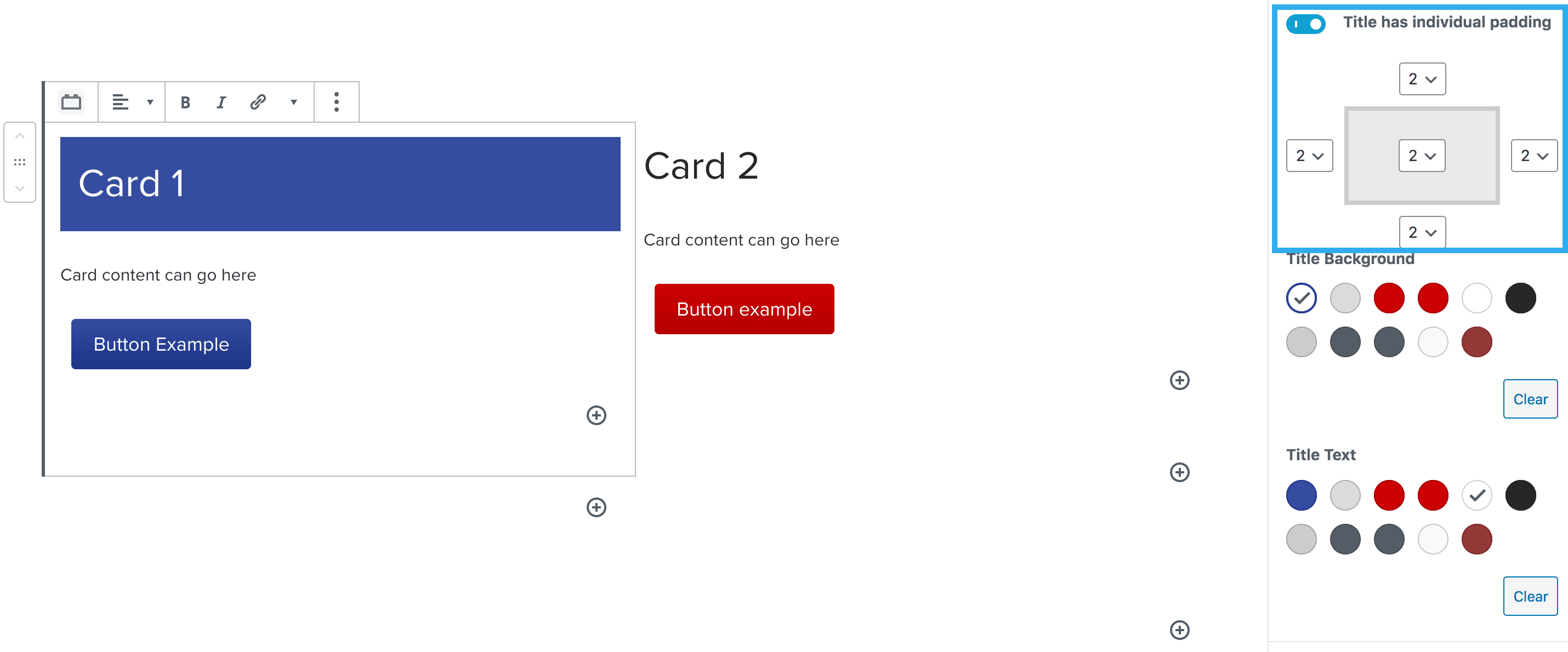
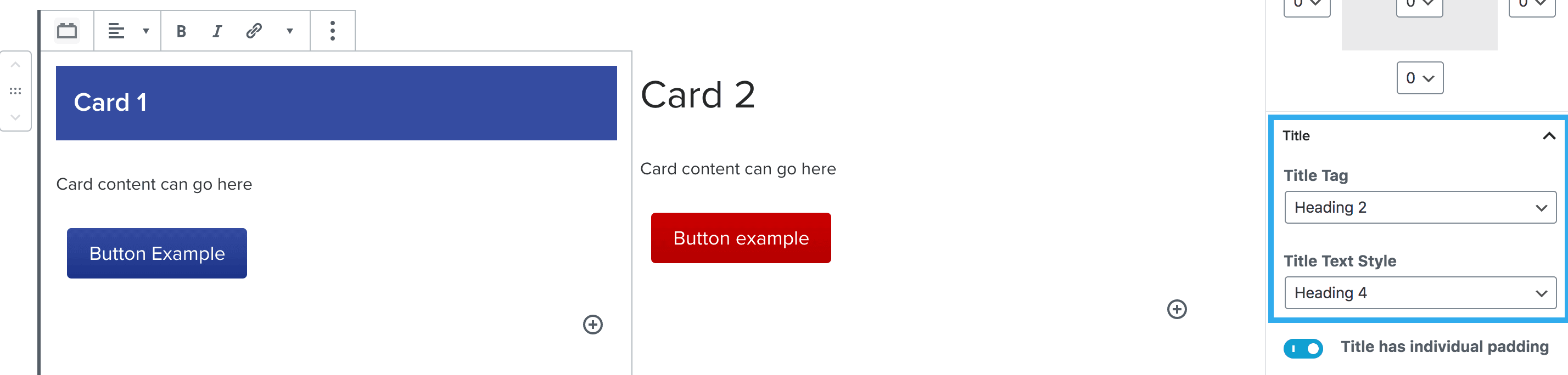
This setting works the same way as the standard heading block where you can select the title tag, but then choose a different style (if desired).
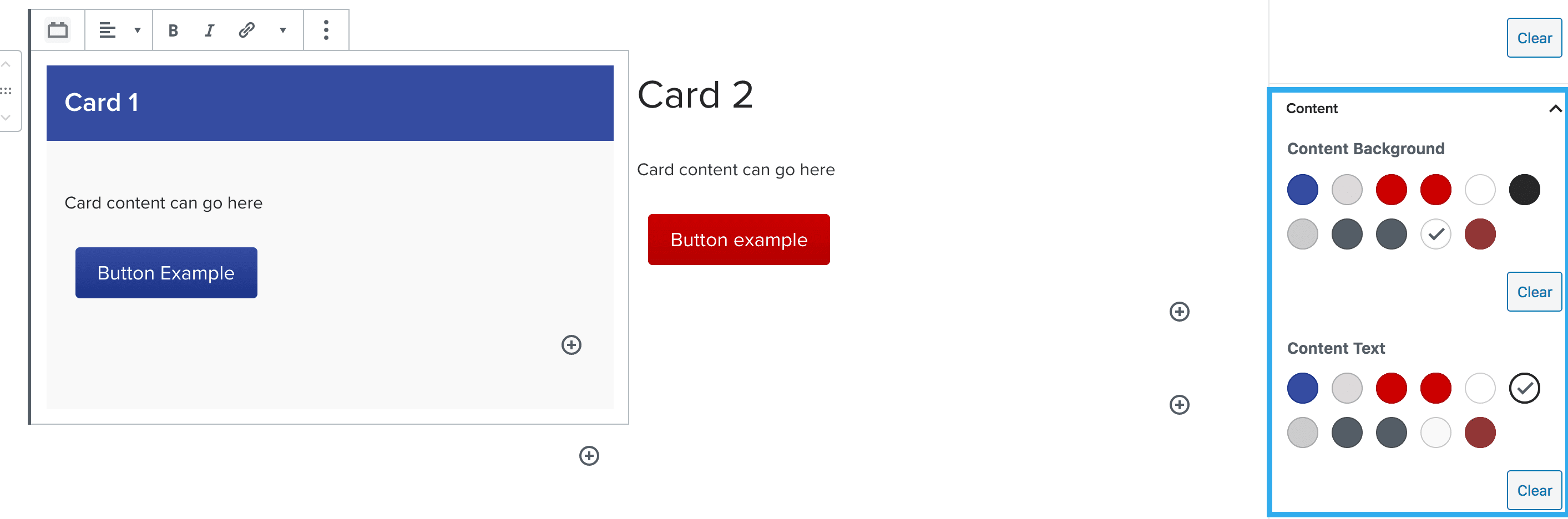
This content is placed below the card title area. You can add any block within this area but the default block placed is the paragraph block.
These settings allow you to select background colour (independent to the title background colour) and also select the content text colour.
You can choose to insert an image into your card using the has image toggle.
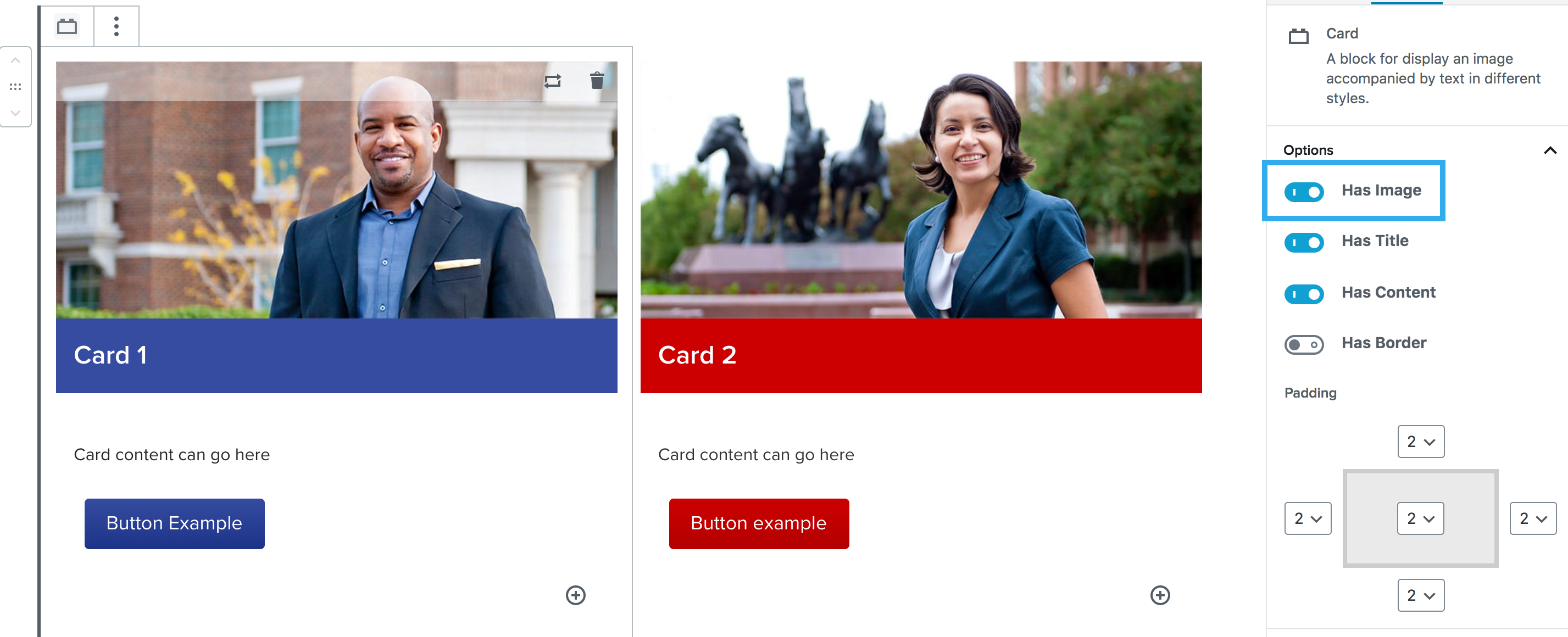
Once you click the has image toggle, new image settings will appear at the bottom of the right-hand panel. These will include:

There are three alignment options for the image:

1. Image above the title area.
This is the default setting when toggling on the image option.
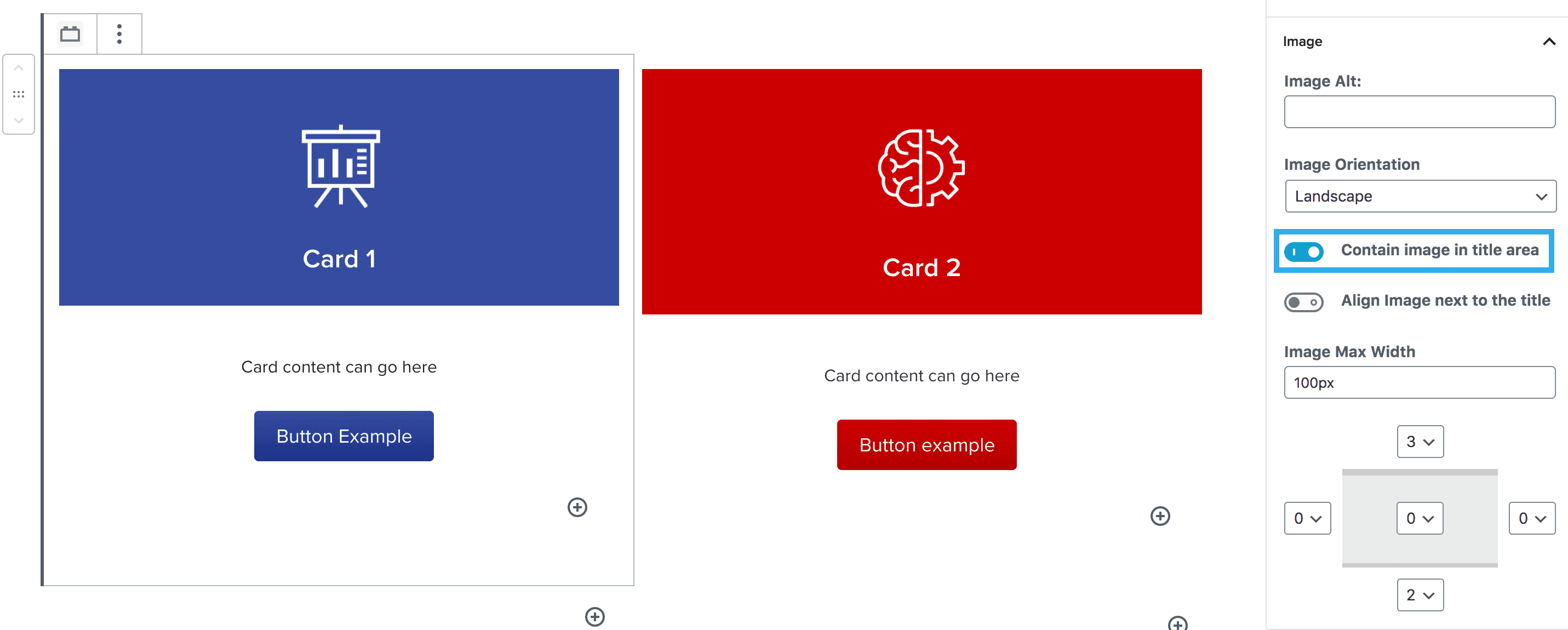
2. Containing the image within the title area.
This setting allows the image to sit within the same area as the card title. This works well for areas like courses where a png icon is used.
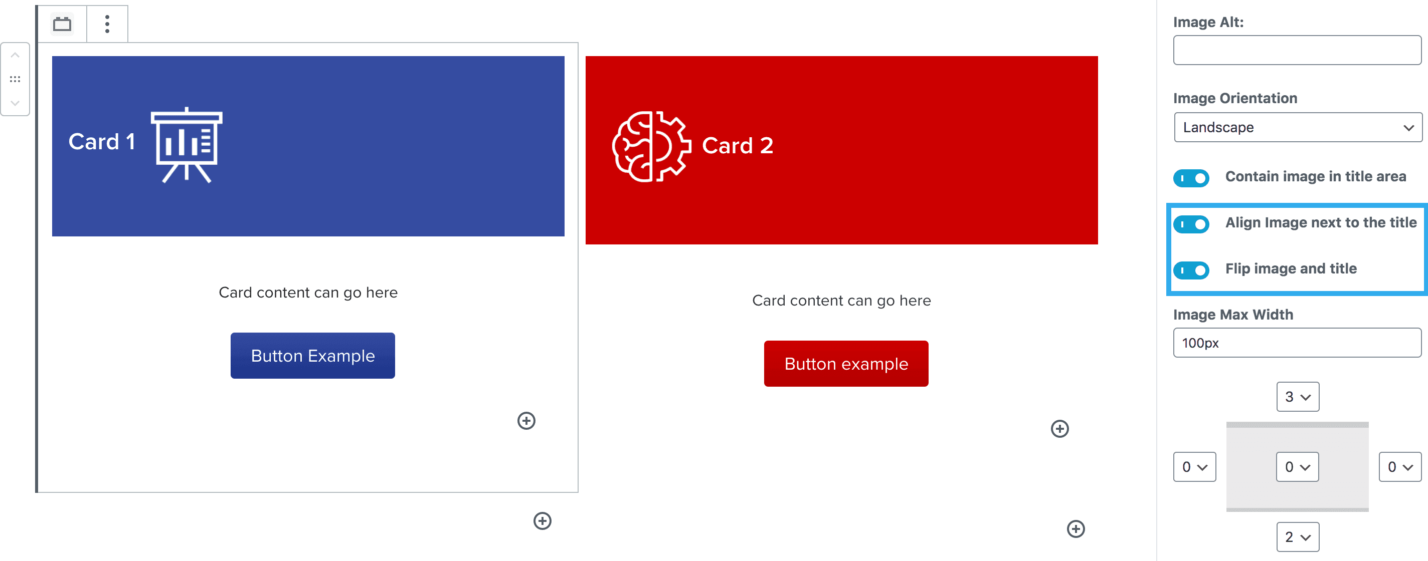
3. Aligning the image next to the title.
If you align the image next to the title, a new setting will appear where you can flip the image and title around.
Other Settings
You can set the image max-width here and also apply padding to the image itself, separate from the card padding settings.
There is an option to add a border around the card block. Choose the color and which sides get a border. Thick border setting can be toggled on/off.