Swiss Army Section Block
The Section Block is one of the most fundamental blocks within the Gutenberg suite on the 2U environment and will often be added to a page automatically. We have adapted this and added new features to improve functionality.
What’s new?
The old Select Background Image button has been integrated with the new features. The wording Select Background Image has been changed to Select Desktop Image to keep it consistent with the new options, but it still works in the same way as the old button.
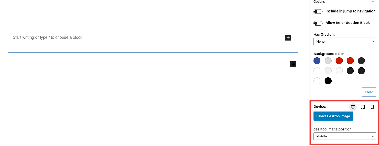
Similarly to the New Image Block there is a device selector that will allow you to select a different image for each device. If only the desktop image is set then that image will be used across all the devices.
Image position
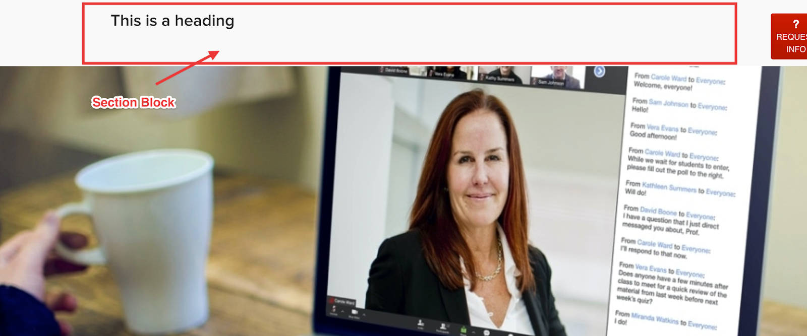
The Image Position has 3 options – Top, Middle & Bottom. These options are device specific. When the section block is loaded on the page all 3 devices image positions are set to middle.
the Top option will put the image above the section block.
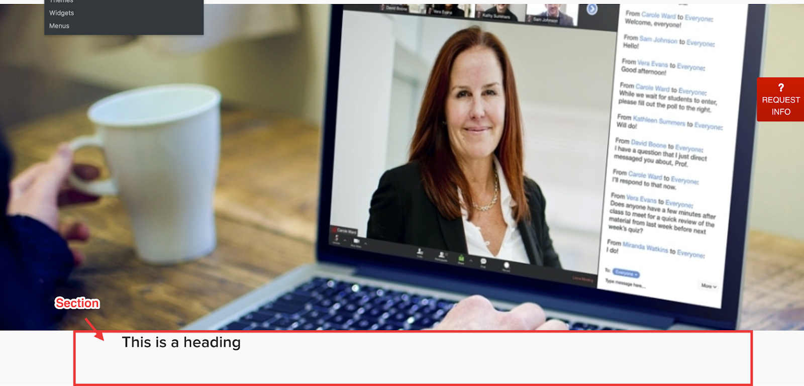
The Middle option will put the image inside the section block. Effectively acting as a background image.

The Bottom option will put the image below the section block.
Headings and Paragraphs
Along with the new features on the section block there are new features that can be applied to the paragraph and heading blocks when used inside the section block. Both the heading and paragraph have the new option below:
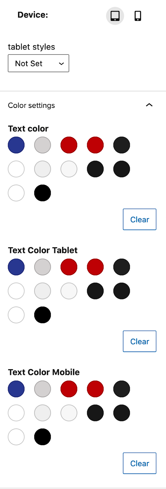
- There is a device selector for tablet and mobile that allows you to change the styles of the heading or paragraph when viewed on a tablet or mobile device.
- There is now the option to change the color at desktop, tablet and mobile.
Note: These options are only available when the heading and paragraph are used inside a section block.
As well as the options mentioned above the paragraph has a new toggle option that can be found below the colour options. This new option add Bold above 1024px when toggled on will bold the text when it is viewed on a display above 1024px wide.