Section Block
The Section Block is one of the most fundamental blocks within the Gutenberg suite on the 2U environment and will often be added to a page automatically. This block should be used to house all other blocks & content when building out a page as it pulls through the container classes and their widths from Whitelabel. These settings can be overridden via the Global Settings area within the WordPress dashboard.
Global Settings pulls through the container class names from Whitelabel, which are:
- container
- container-narrow
- container-wide
- xwide
Within the section block, there are a number of settings, to give you the ability to create different content widths, section background colours, background images and also a margin selector, to choose the top & bottom margins for your section block.
Note: When adding a section block, the block editor will have the paragraph block selected within the section block, which automatically gets populated along with with section block. In order to access the section block settings, go to the block navigation and select the section block.
Padding Controls
This setting within the block, allows you to set the padding inside of the Section container.
Note: The padding-top option will NOT work on the first section block on the page due to the default rules previously added for the first section on the page.
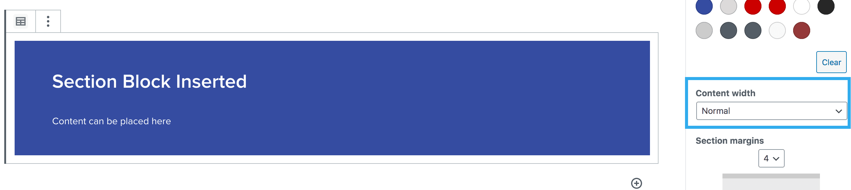
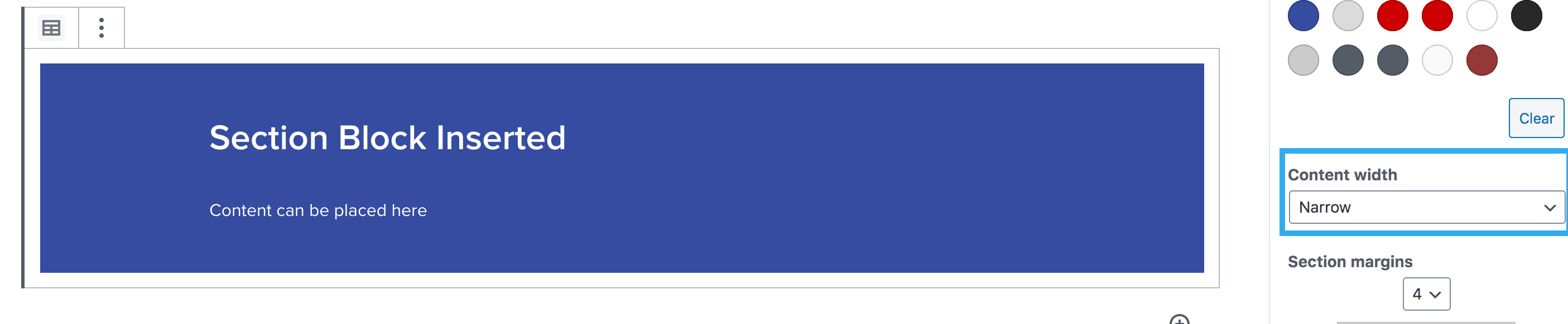
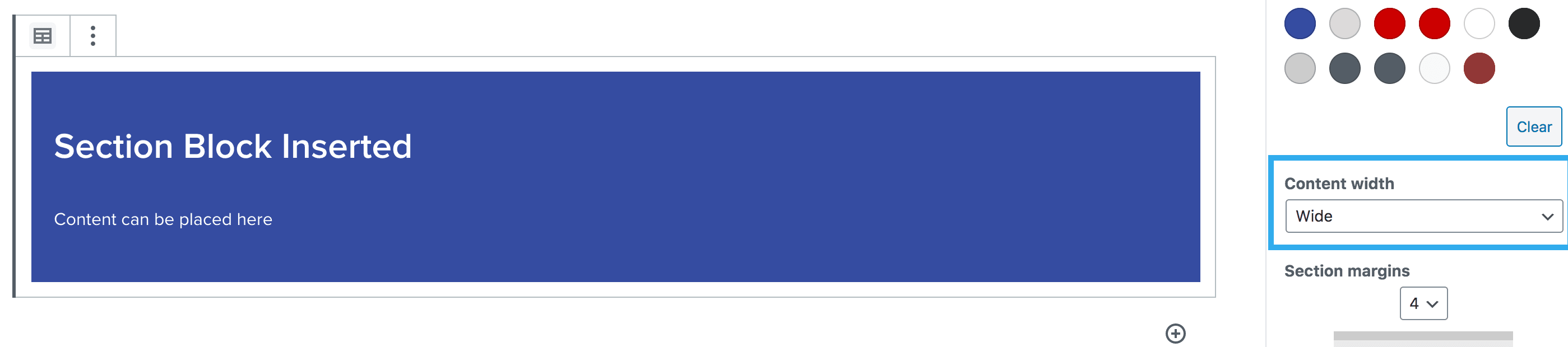
Content Width Setting
This setting within the block, allows you to choose from the container classes that are pulled from Whitelabel. Once selected, you will be able to see the change within the block editor.
Normal – 1152px (equivalent to container):
Narrow – 960px (equivalent to container–lg):
Wide – 1960px:
Background & Content Colour Setting
This setting within the block, allows you to change the background colour of the section, alongside the content colour. The colour palette will allow the users to select colours which have been pulled from Whitelabel and used within that site’s theme. There is no option to select a new colour, unless an admin level user adds the new colour, via the global settings.
Note: you can also click ‘clear’ to return back to the default colour setting
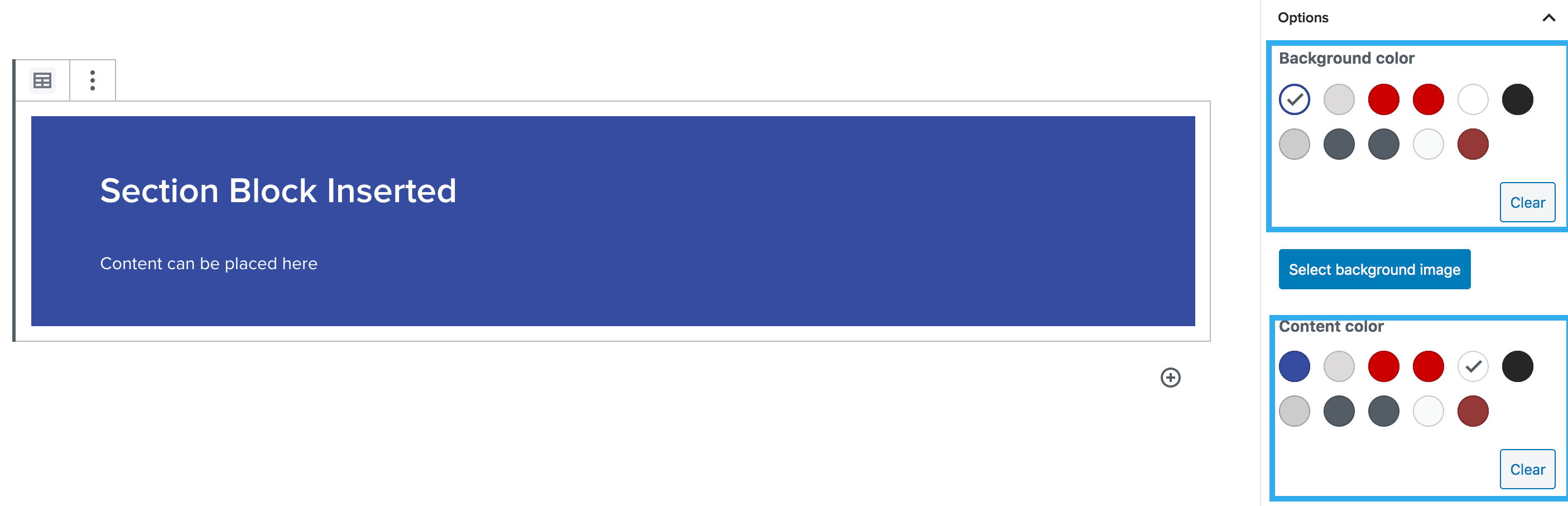
The section block also includes a feature which triggers an alert should the background and text colour combination not meet the minimum colour contrast.

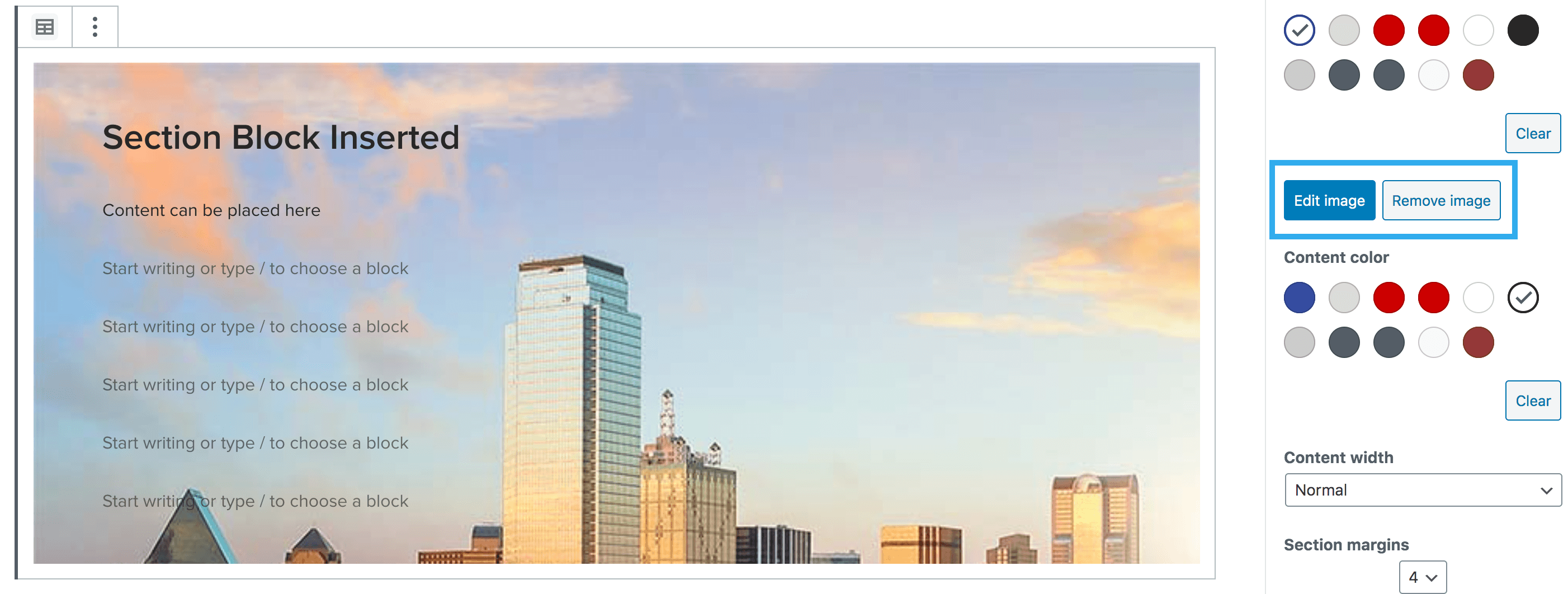
Background Image Setting
This setting within the block, allows you to add a background image to the section. You can also adjust the height of the section, once an image is inserted.
Note: Although this means that a section block can work similarly to a hero block, you would use a section block when you need to use other elements/blocks within. Hero blocks only allow for the hero title/text, buttons, and lead forms.
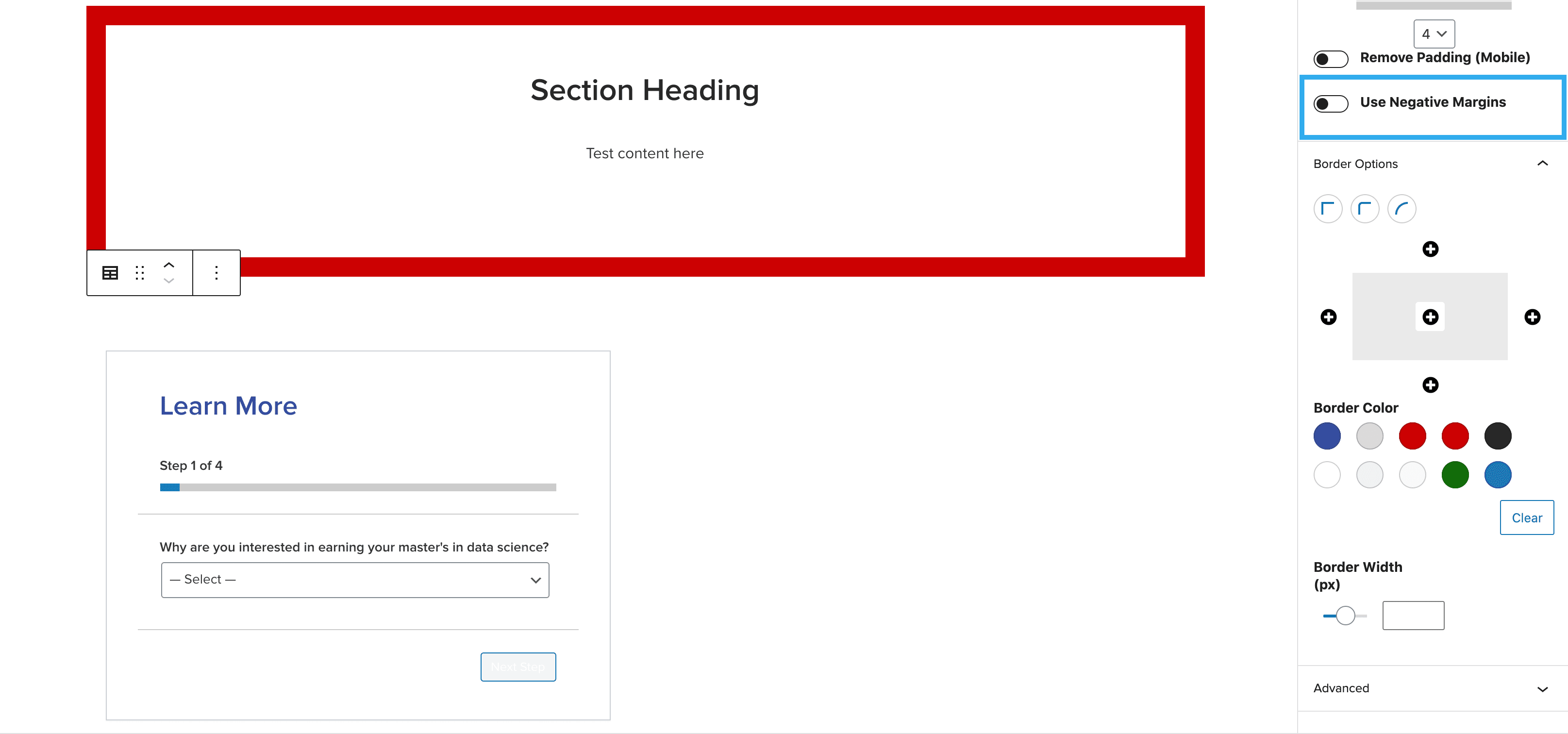
Border controls
This block also has the option to add borders to each section. These settings allow you to toggle a border on/off for your section. You can adjust the border radius along with the colour of the border. You can also increase the thickness of the border using the slider. You can choose between 1-50.
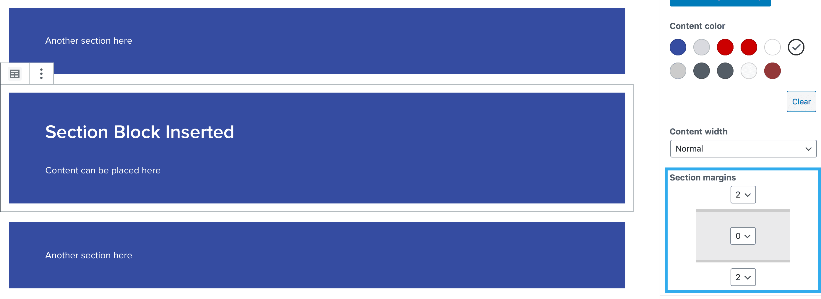
Margin Component Setting
This setting within the block, allows you to adjust the top & bottom margins of your section, to separate this from content above/below the block. The margins are taken from Harmony and range from margin 1 – 8.
Note: when initially inserting a section block, the margins will default to ‘margin 4’ (top & bottom)
Margin rules are below:
- Margin 1 = 8px
- Margin 2 = 16px
- Margin 3 = 24px
- Margin 4 = 32px
- Margin 5 = 40px
- Margin 6 = 48px
- Margin 7 = 56px
- Margin 8 = 64x
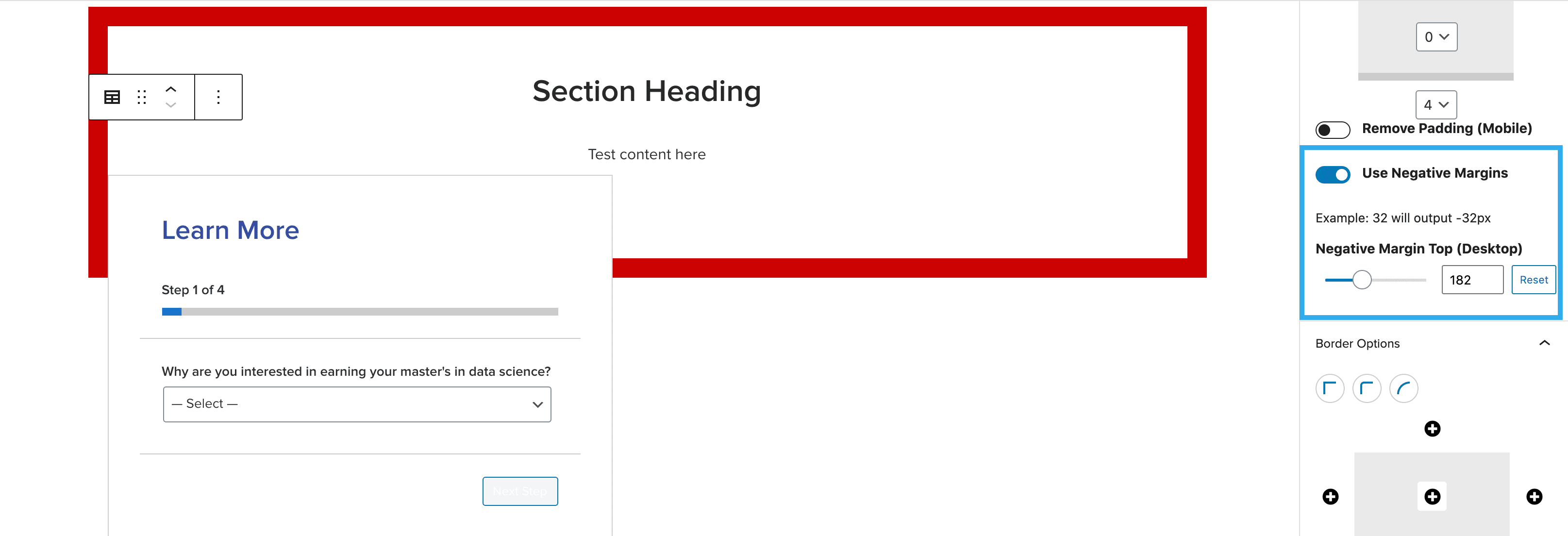
Negative Margins
This block also has the ability to set a negative margin, so sections have the ability to overlap with each other (see below example).
To use this feature, create a section to house your desired content. Then create a second section to hold the content you wish to overlap. On the overlapping content, toggle on ‘Use Negative Margins’ then use the slider to find your desired margin size.
Note: the number you select will output the negative. Example 50 = -50px
You can add also horizontal & vertical ‘gradient’ settings and select the gradient colours, plus gradient height option so you can control the height/width of the gradient. The block has the ability to nest a section block within another section blocker, all of which can be altered with responsive toggle controls.