Heading Block
The heading block has all of the heading & display styles and rules passed down from Harmony. This block can be inserted within any block e.g. Sections, Columns, Accordions etc.
Below are examples of the heading & display styles available within this block:
Heading 1
Heading 2
Heading 3
Heading 4
Heading 5
Heading 6
Display 1
Display 2
Display 3
Display 4
Display 5
Display 6
Heading Style Setting
When inserting a heading tag e.g. H2, the block will automatically apply the style that is attached to that H tag, so you wouldn’t need to select styles if you are wanting to use the default ones shown above.
If you want to display a heading using a different style to the default e.g. if you want to output a H2 which looks like a H3 you can do so by using the styles setting.
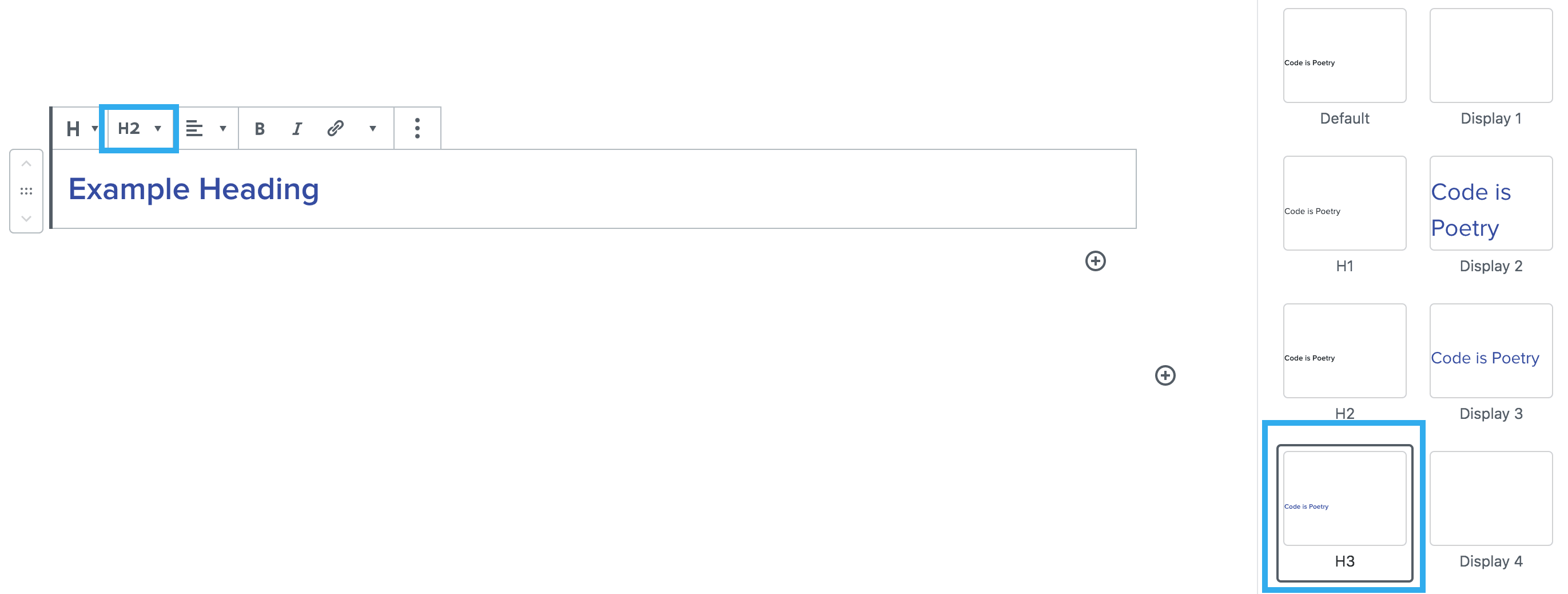
This block also enables the ability to set different header styles specific to desktop and mobile. Meaning when the heading is viewed on mobile it can appear differently to how it is viewed on desktop.
Note: for UX purposes when a style is selected you will be able to clearly see which one is applied within the toolbar dropdown
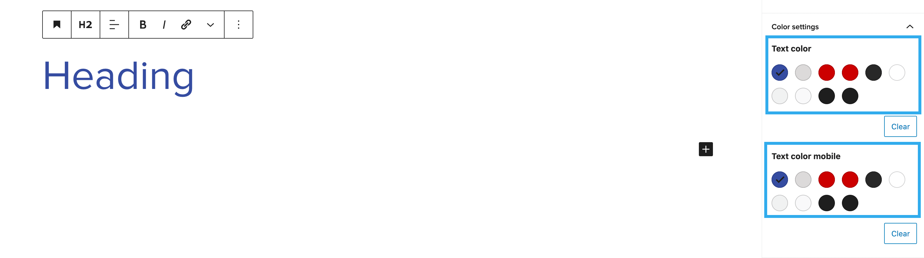
Heading Colour Setting
This setting allows you to override the colour that is applied to the heading or display style you have chosen. Similarly to the style settings you can also select different colours for desktop and mobile. When the heading is viewed on mobile it can have a different colour to how it is viewed on desktop.
Note: you can easily go back to the default colour by clicking ‘clear’ underneath the colour palette.
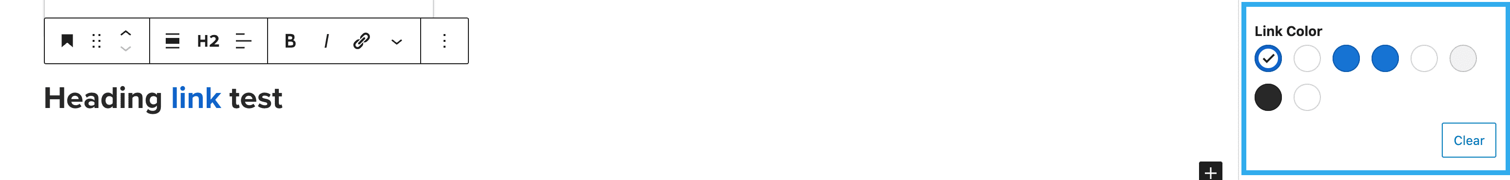
The heading block also has the ability to change the colour of selected text or word within the same heading.

There is also the ability to alter the link colour independently from the rest of the heading.
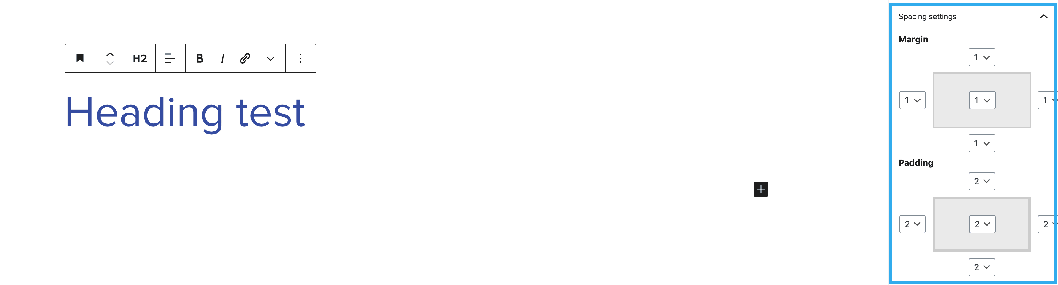
Spacing
The spacing settings allow you to alter the margin and padding around the heading. Each side of margin and padding can edited independently from one another and can be previewed in the settings panel: