Column Builder
The column builder is another fundamental block within the Gutenberg suite on the 2U environment. The column builder houses all of the page layout variations & ratios available across the platform. This has responsive breakpoints predefined within the block, so you don’t need to add these manually.
As mentioned within the section block, the column builder should always be placed inside of the section block, to get the most benefit from the margin & padding settings.
Column Layout & Ratio Settings
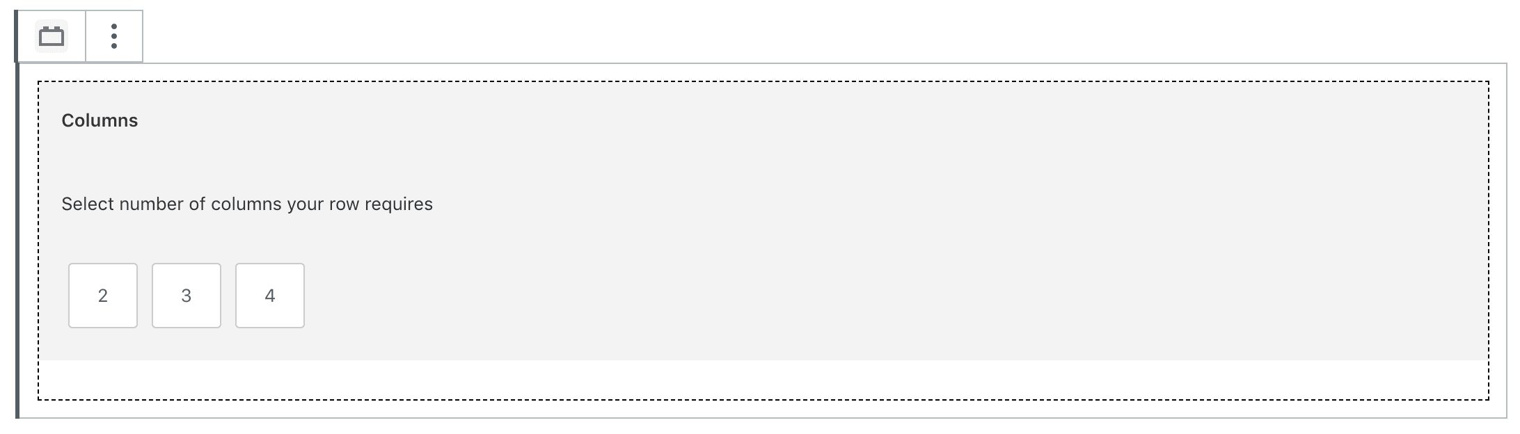
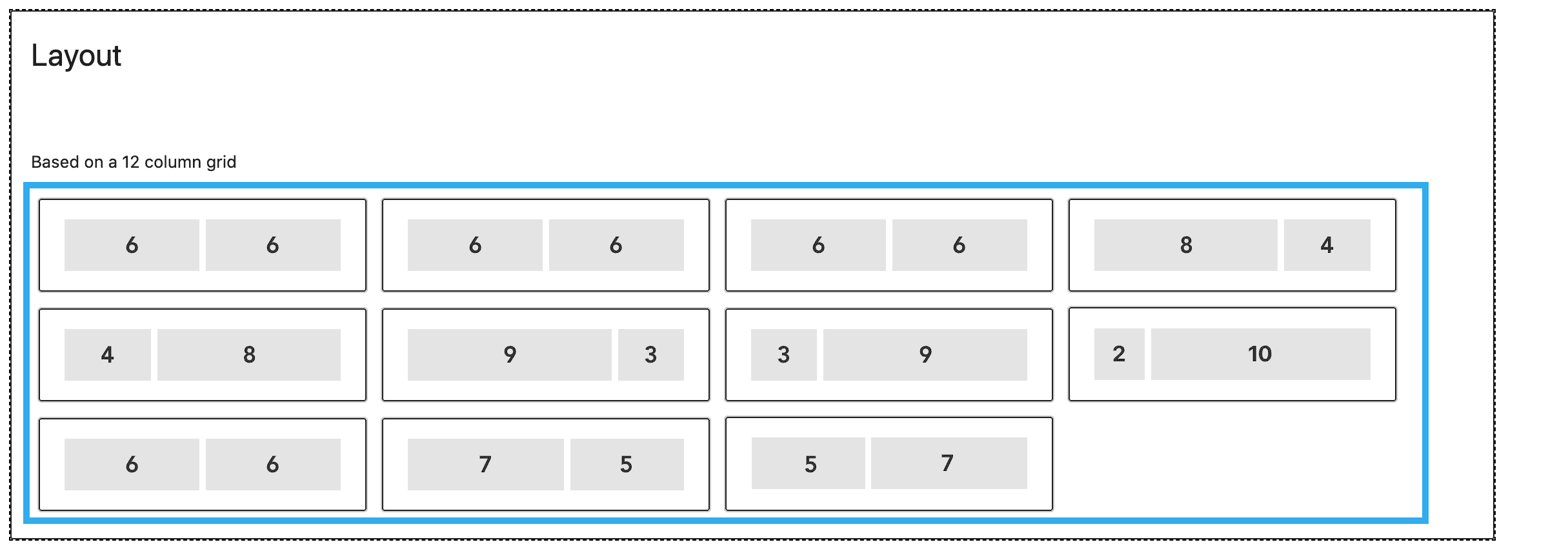
When you initially insert the column builder block, you will be prompted to choose the number of columns your row requires, along with the ratio (which is based on a 12 column grid).
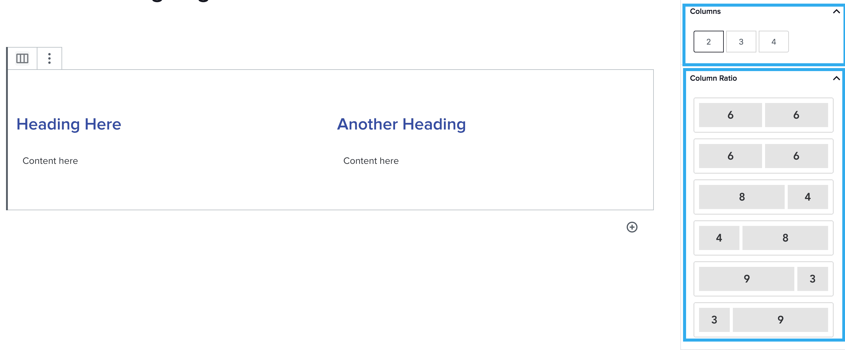
Once you have selected these, you can easily change the layout / ratio using the settings in the right-hand block settings panel. Once you have chosen your layout / ratio settings, you can begin adding other blocks to each of your columns.
Note: All blocks within the Gutenberg suite, can be placed within the column builder, with the exception of the section block.
Column Background Colour Setting
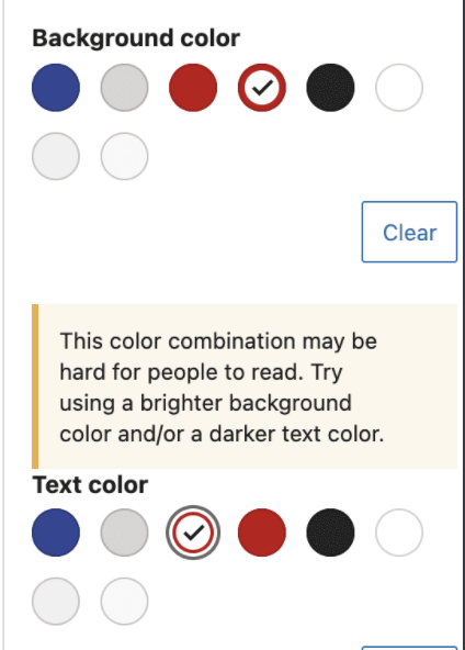
This setting within the column builder block, allows you to add a background colour to a specified column. Alongside this, you can change the content colour to ensure it meets accessibility standards.
The colour palette comes directly from Whitelabel, so a user will not have the ability to add a new colour to the palette, unless this is authorised and added by an Admin level user, via the global settings section within the WordPress dashboard.
Note: You can also click ‘clear’ to set the background or content colour back to its default.
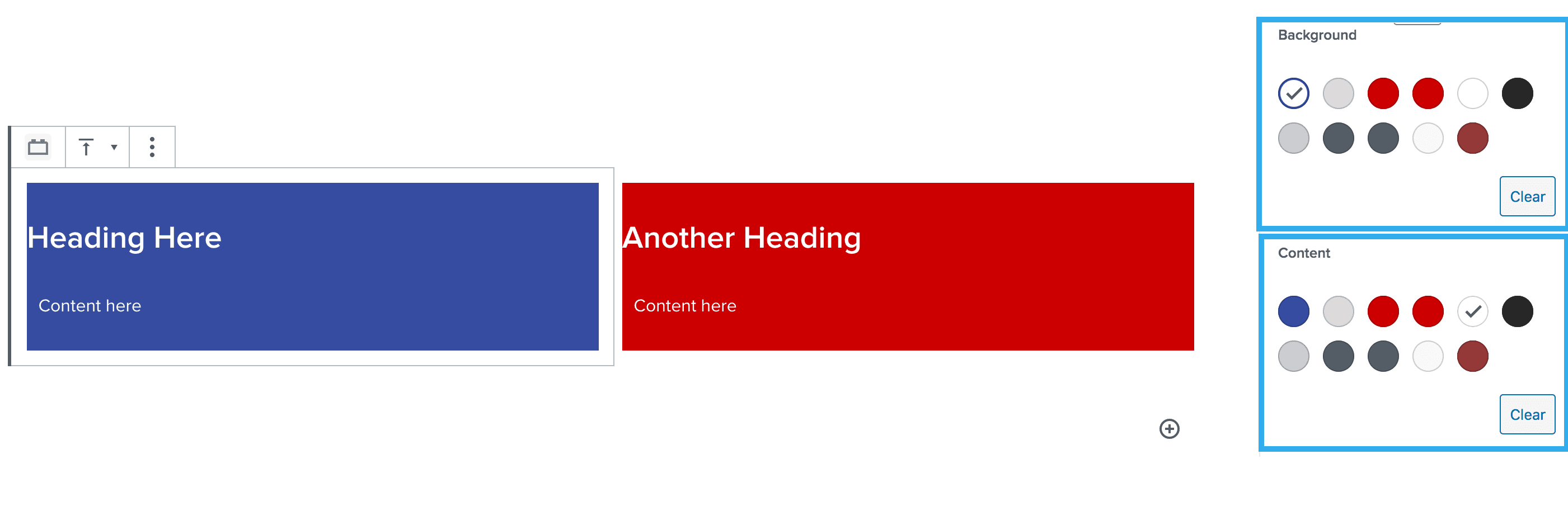
The column builder also includes a feature which triggers an alert should the background and text colour combination not meet the minimum colour contrast.
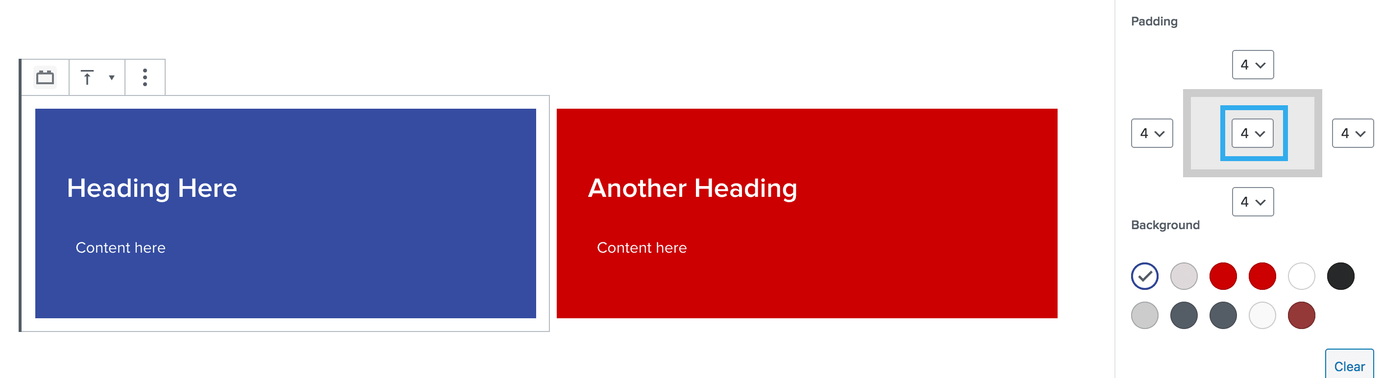
Padding Component Setting
This setting within the column builder block, allows you to add padding to the top, bottom, left & right sides of each column. The padding rules are taken directly from Harmony and range from padding 1 – 8.
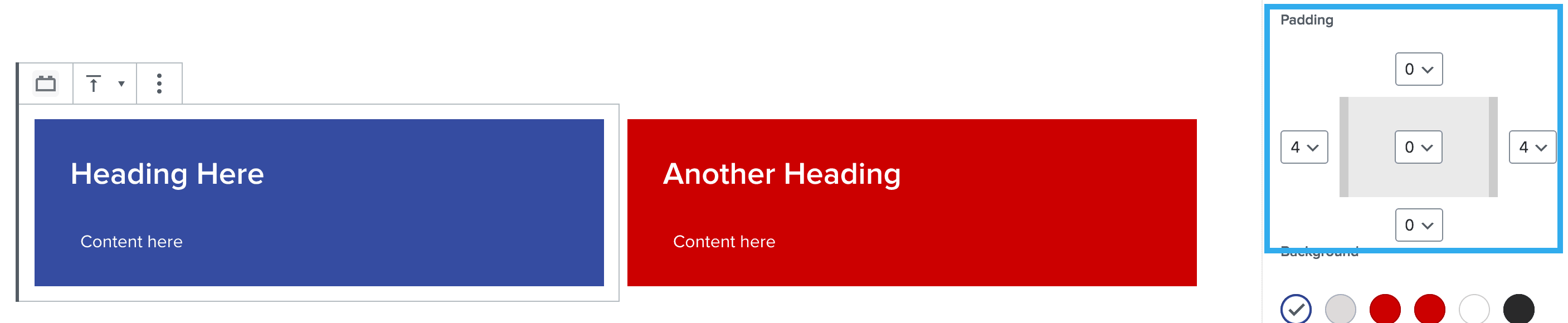
Note: You can also choose to set padding to all sides by using the dropdown in the middle of the component.
Padding rules are below:
- Padding 1 = 8px
- Padding 2 = 16px
- Padding 3 = 24px
- Padding 4 = 32px
- Padding 5 = 40px
- Padding 6 = 48px
- Padding 7 = 56px
- Padding 8 = 64x
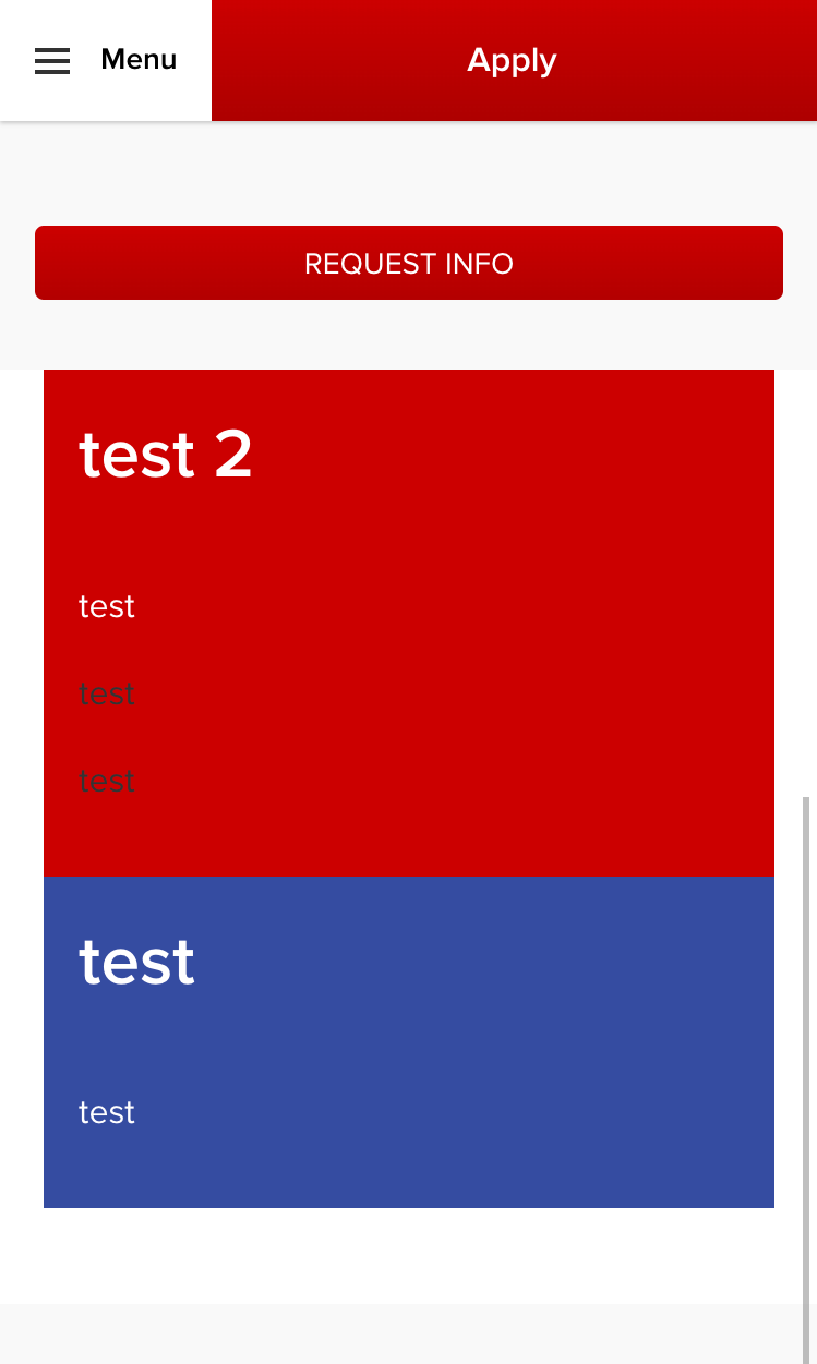
Reverse Columns Setting (for mobile view)
This setting within the column builder block, allows you to flip the content on mobile view. This is best used when there are multiple 50% | 50% columns with text on one side and an image on the other. This allows you to have an image, text, image layout on mobile view.
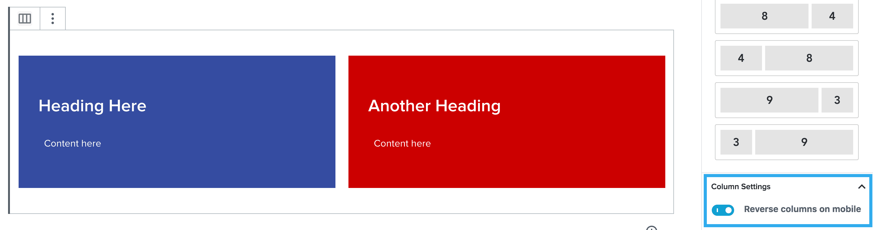
This will flip the columns on mobile devices and will appear like this:
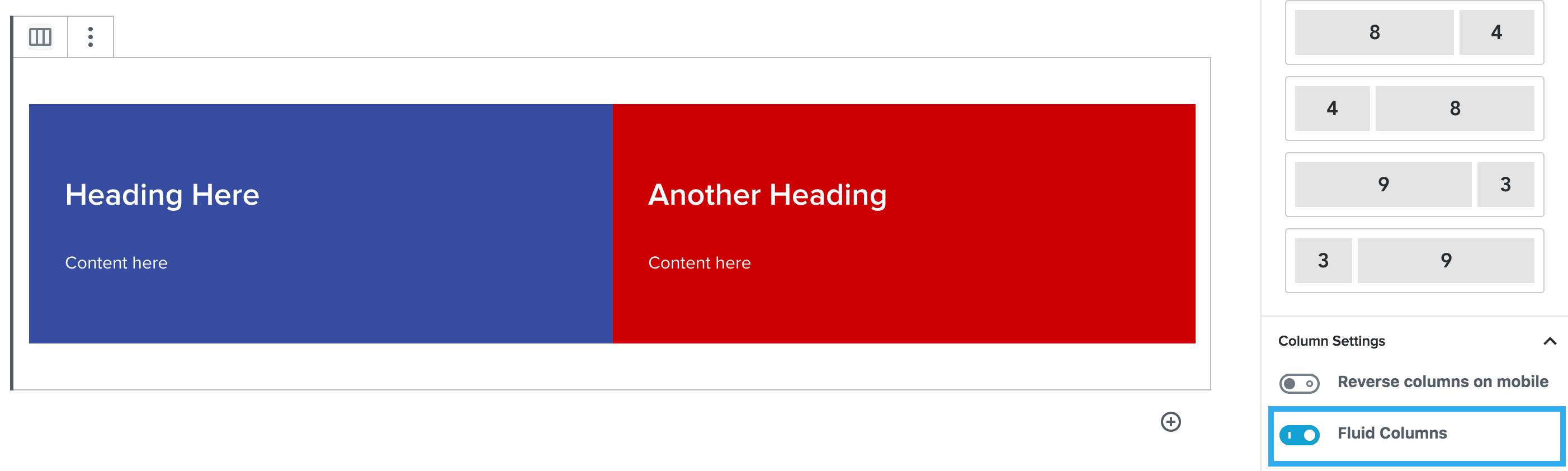
Fluid Columns Setting
This is a very simple setting which enables you to remove the margin between each column.
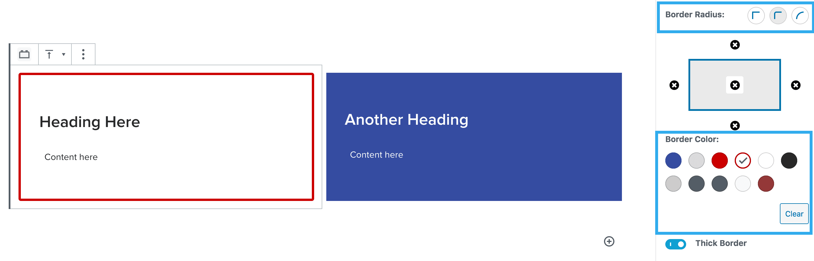
Border & Border Colour Setting
This setting within the column builder block, allows you to toggle the border on/off, then select the sides of the column that you want to apply the border to.
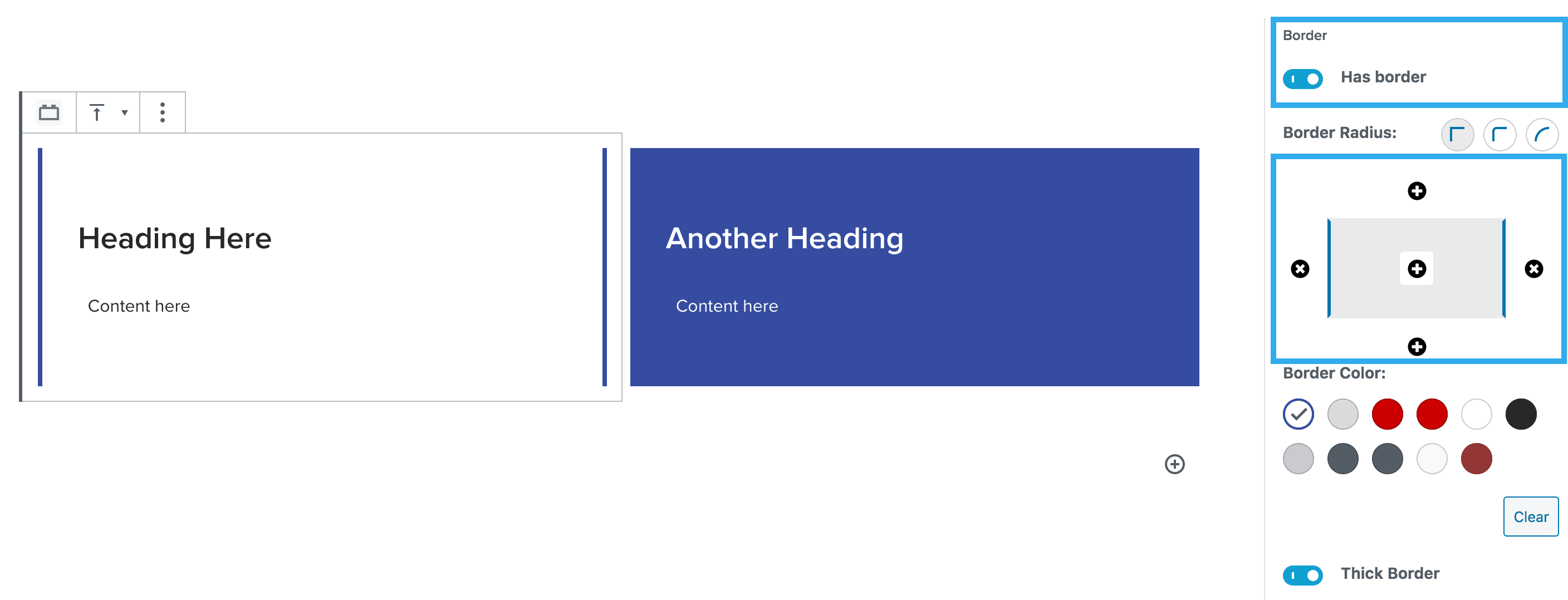
Note: you can easily apply the border to all sides by clicking the middle ‘+’ option within the border component.
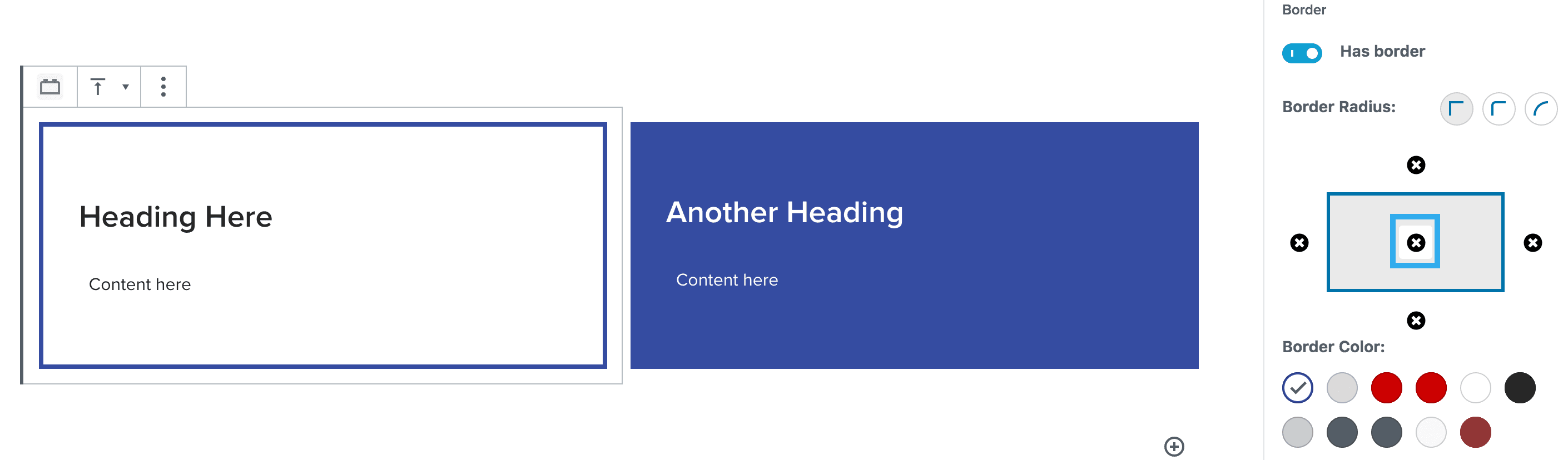
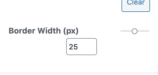
You can also adjust the border radius along with the colour of the border. You can also increase the thickness of the border using the slider. You can choose between 1-50.
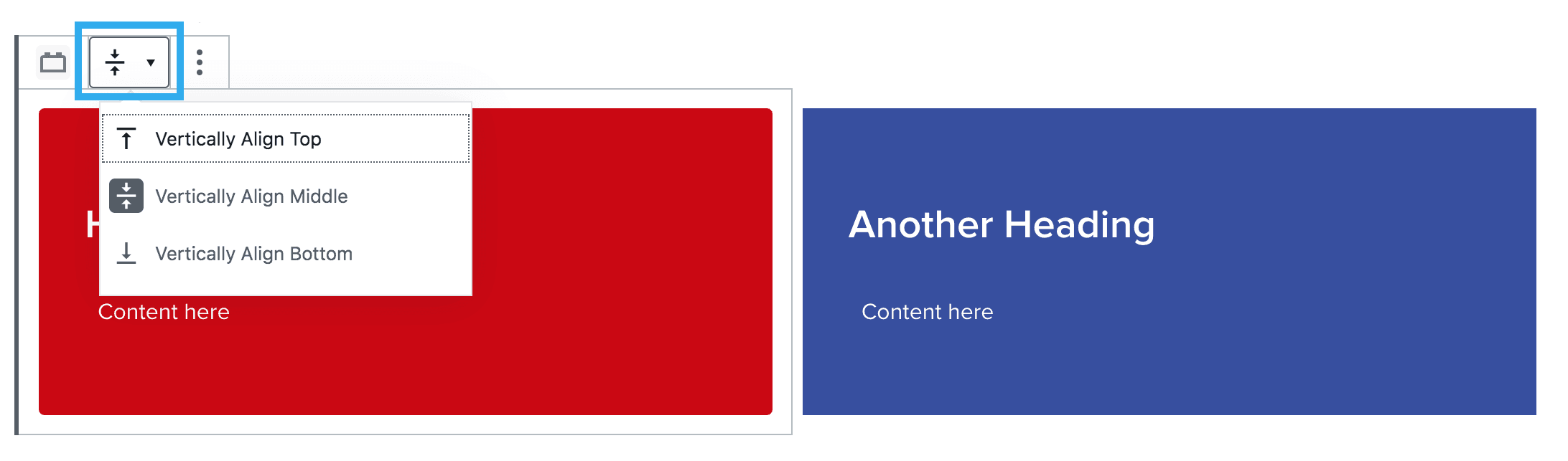
Vertical Alignment Setting
This setting within the column builder block, allows you to choose the vertical alignment of the content within the column.