Accordion Block
The Accordion Block allows you house a bunch of content e.g. FAQs into collapsable elements and output Schema for these items.
Accordion Item #1
Here is some example collapsable content
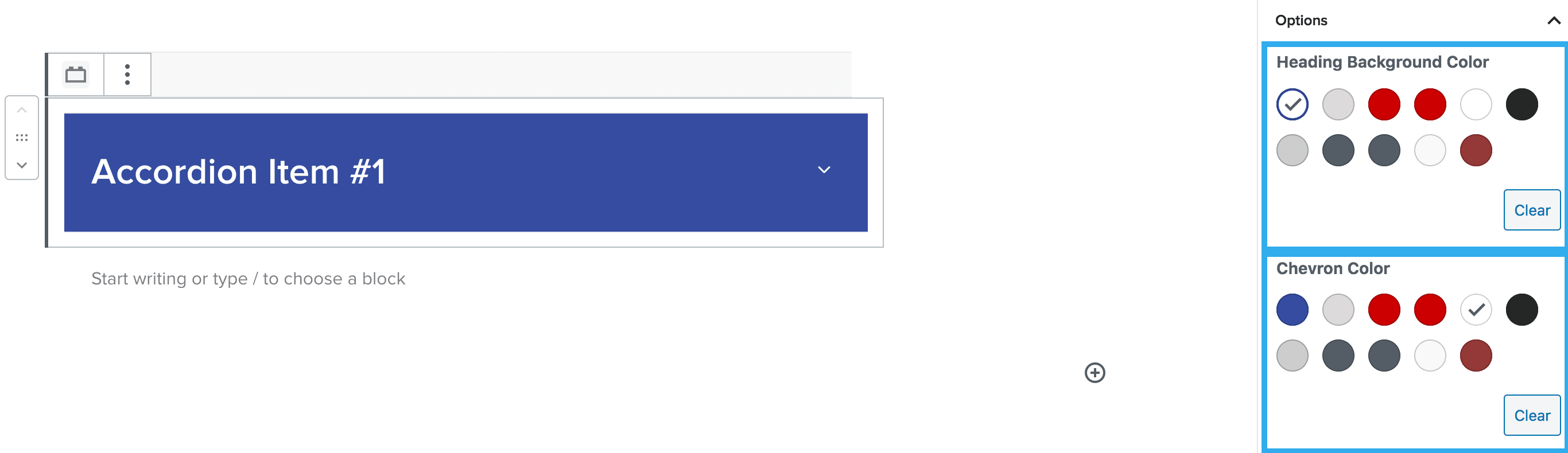
Heading Background & Chevron Colour Setting
This setting allows you to select a background colour for your heading items & also allows you to change the colour of the chevron icon within your drop-downs.
Note: you would apply your heading settings within the heading block as standard i.e. choosing the H tag, style etc
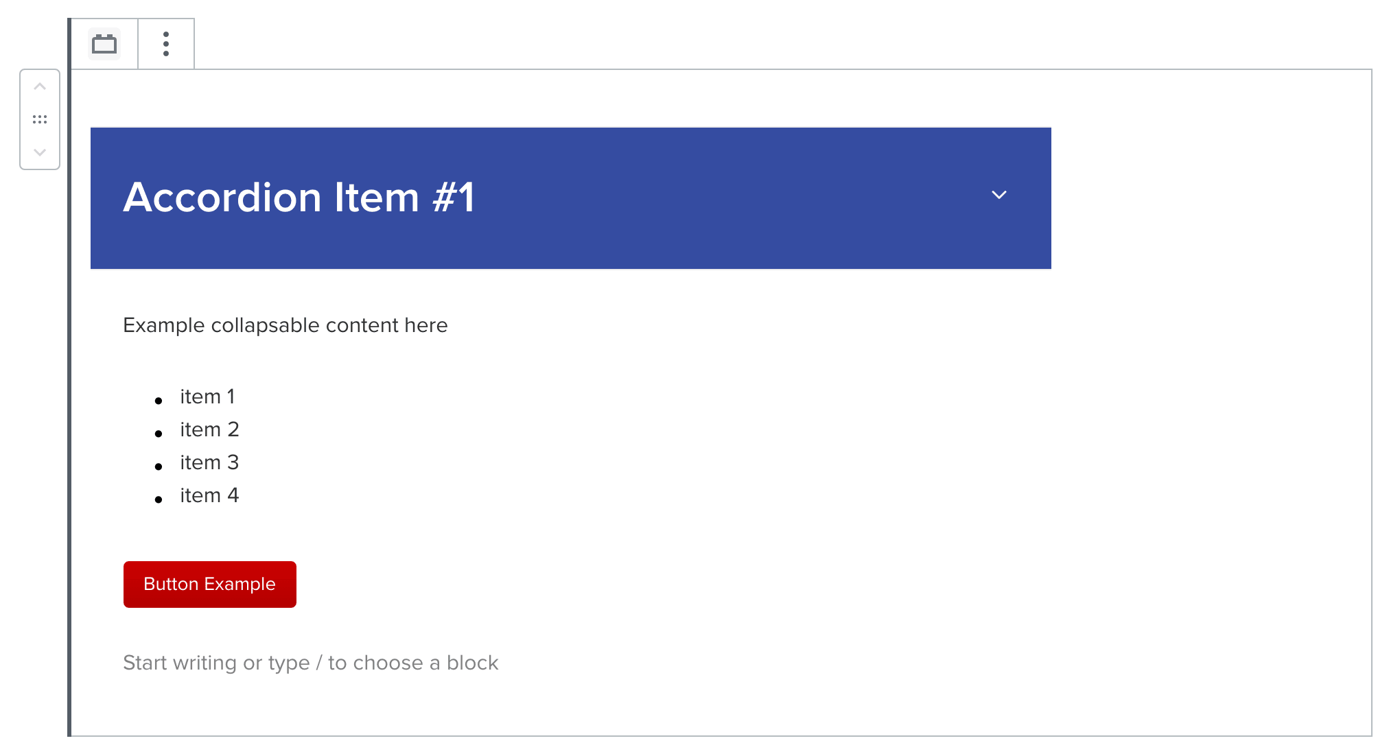
Once you have selected your heading & chevron settings; you can start adding blocks to the content area below the drop-down. The accordion block allows you to insert mostly any block within this area and padding on the collapsable area is automatically inserted for you.
Note: Any block you insert within the collapsable area, will have it’s own individual settings e.g. paragraph text will have all of the settings included such as margin, padding, text colour etc if needed.
In the Accordion block settings the accordion type can be configured to the standard accordion, or the FAQ format. The difference is a specific schema that can be applied to the FAQ type (also from the block settings).
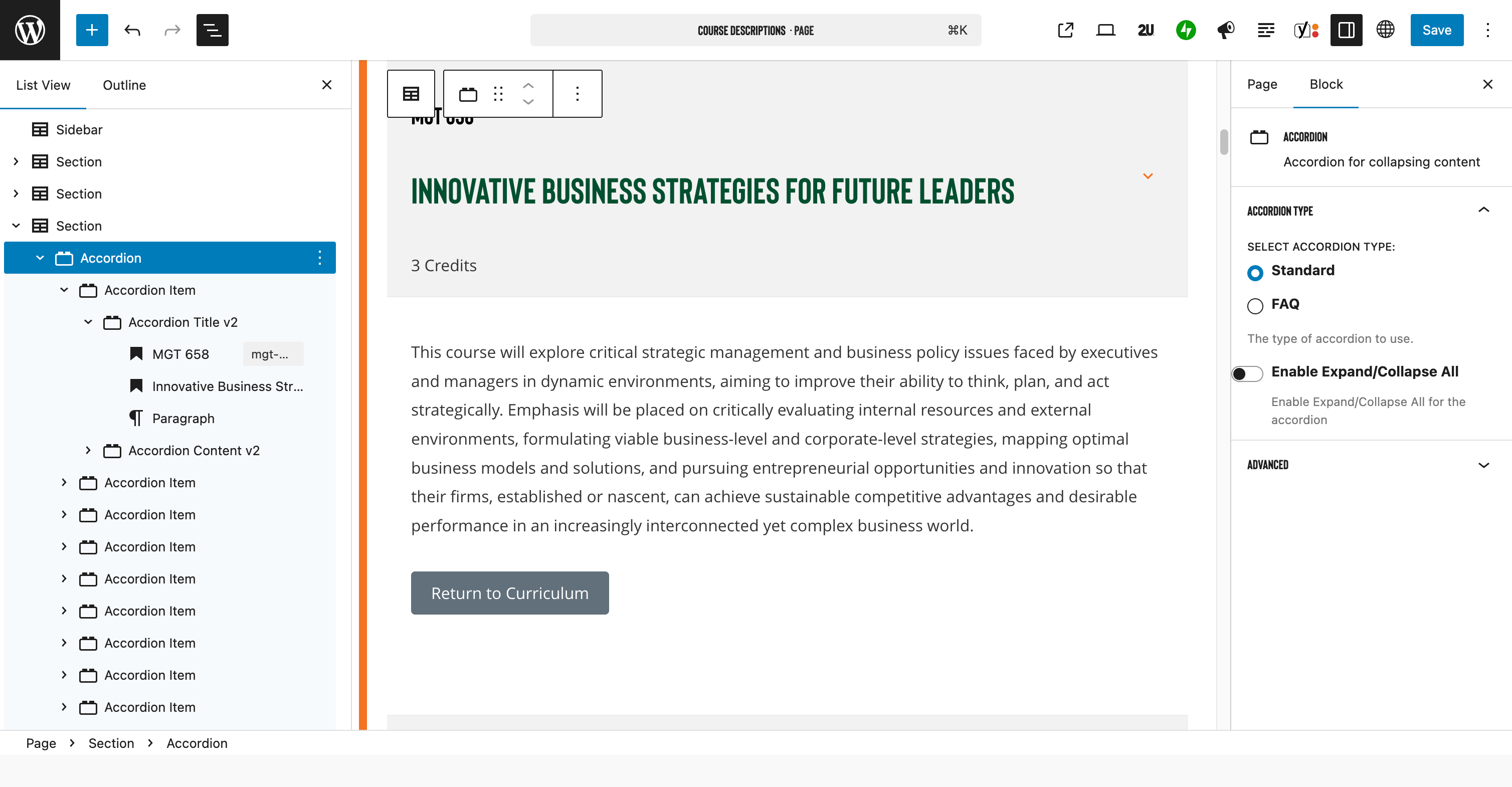
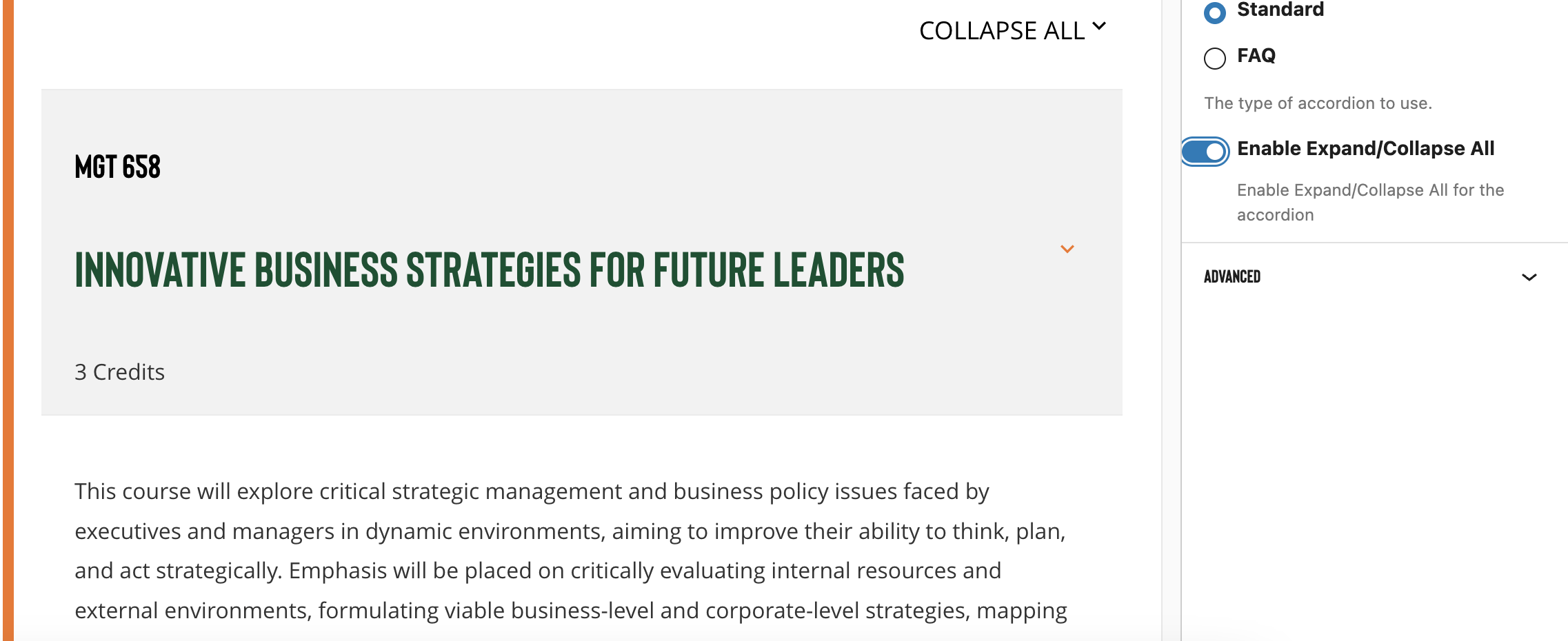
Also within the block settings is a toggle to expand/ collapse all. When this is enabled a dropdown appears above the first accordion block header that allows the user to open or close all accordion items at once.
Keyboard accessibility is also supported within this block